Design System Card Set
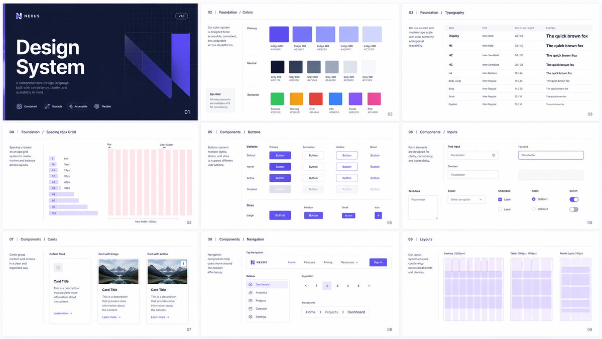
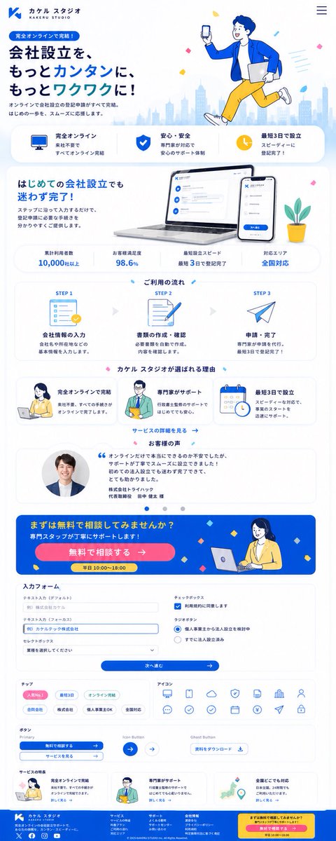
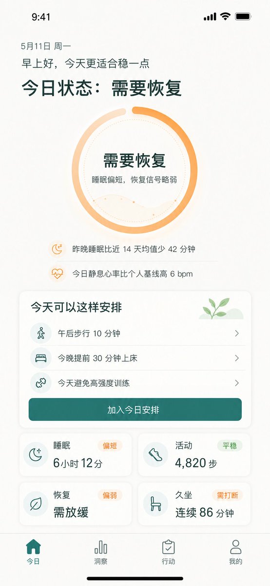
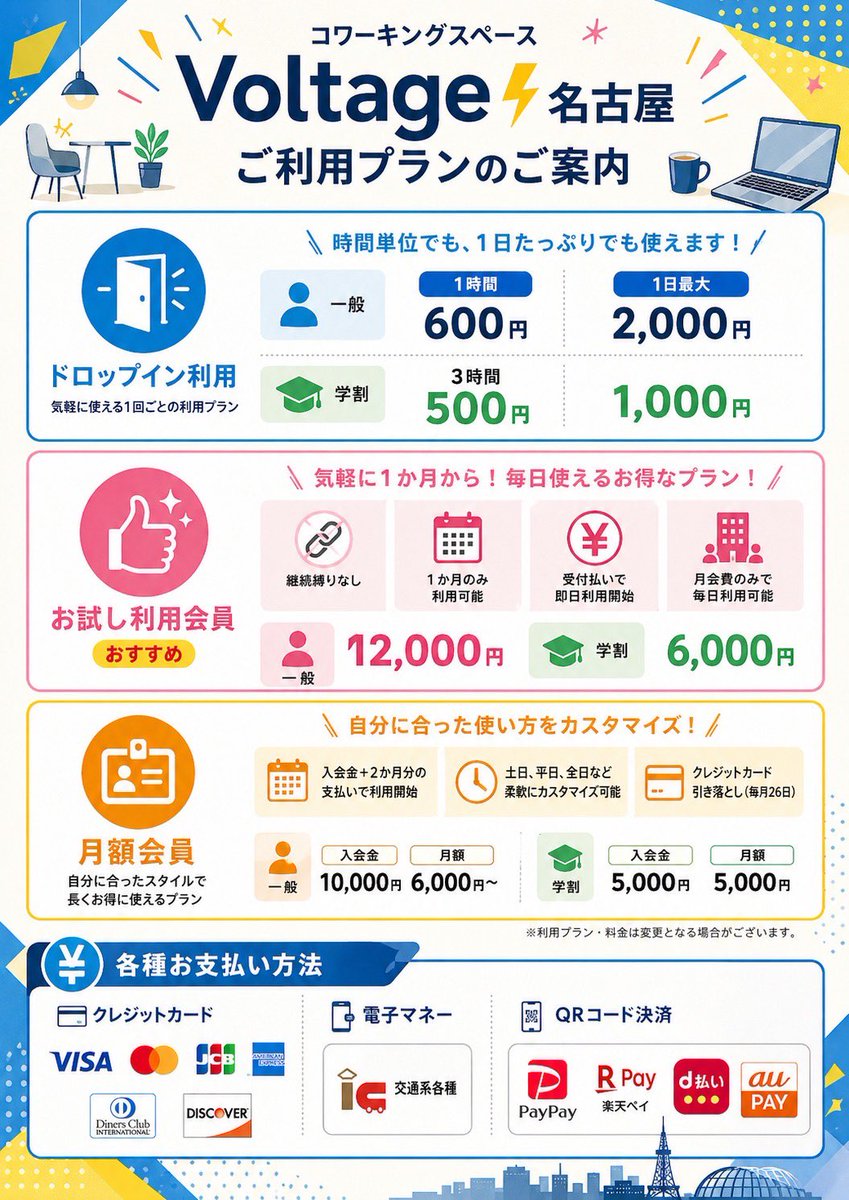
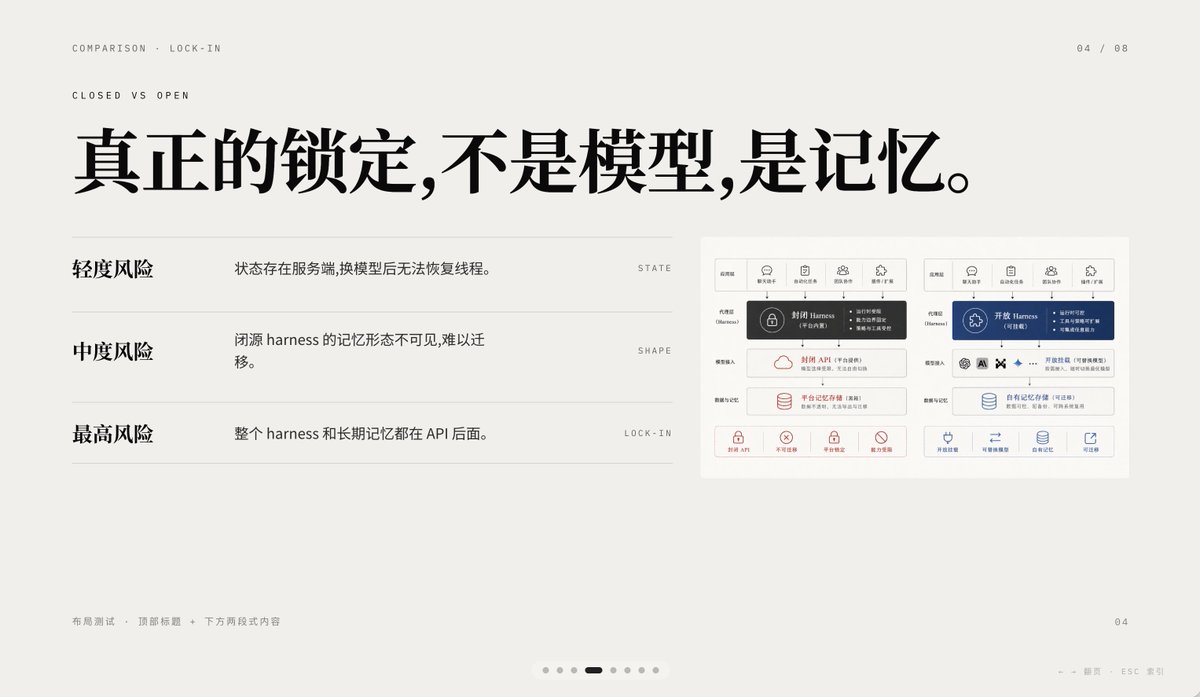
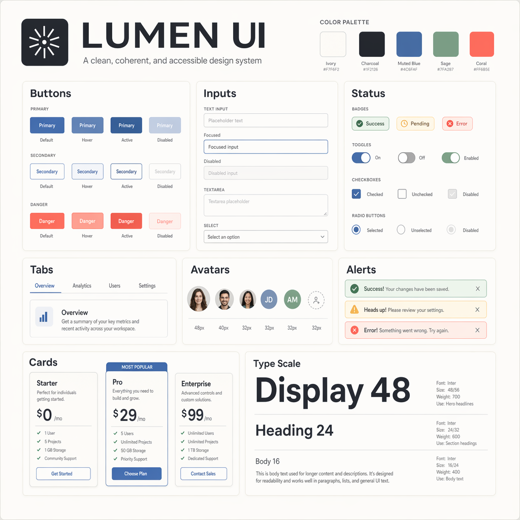
Generate a clean design system overview board for a fictional product language called LUMEN UI, arranged as a square component gallery on a 2048x2048 canvas. Use a neutral palette
- Category
- UI & Interfaces
- Model
- GPT Image 2
- Creator
- wuyoscar
- Source language
- en
- Source ID
- 104
Full prompt
Generate a clean design system overview board for a fictional product language called LUMEN UI, arranged as a square component gallery on a 2048x2048 canvas. Use a neutral palette of ivory, charcoal, muted blue, sage, and coral accents. The composition should be an orderly grid of cards showing buttons, input fields, badges, toggles, tabs, avatars, alerts, and pricing cards. Include crisp typography, even spacing, subtle shadows, and exact alignment as if exported from a professional design tool. Add labeled sections with the in-image text "LUMEN UI", "Buttons", "Inputs", "Status", "Cards", and "Type Scale". Include sample button labels "Primary", "Secondary", and "Danger"; badge labels "Success", "Pending", and "Error"; and typography specimens "Display 48", "Heading 24", and "Body 16". Ensure the board feels systematic, editorial, and highly legible, with clean hierarchy, correct labels, and polished component consistency suitable for a design systems gallery.
Translations
Design System Card Set
enGenerate a clean design system overview board for a fictional product language called LUMEN UI, arranged as a square component gallery on a 2048x2048 canvas. Use a neutral palette of ivory, charcoal, muted blue, sage, and coral accents. The composition should be an orderly grid of cards showing buttons, input fields, badges, toggles, tabs, avatars, alerts, and pricing cards. Include crisp typography, even spacing, subtle shadows, and exact alignment as if exported from a professional design tool. Add labeled sections with the in-image text "LUMEN UI", "Buttons", "Inputs", "Status", "Cards", and "Type Scale". Include sample button labels "Primary", "Secondary", and "Danger"; badge labels "Success", "Pending", and "Error"; and typography specimens "Display 48", "Heading 24", and "Body 16". Ensure the board feels systematic, editorial, and highly legible, with clean hierarchy, correct labels, and polished component consistency suitable for a design systems gallery.