贝多芬大提琴奏鸣曲海报
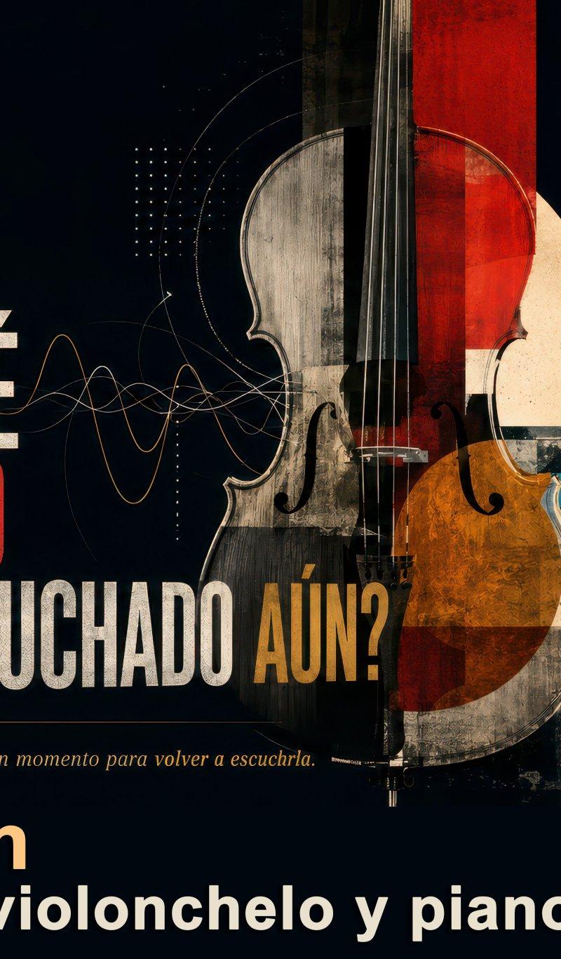
一张复古风格的西班牙语编辑式音乐会海报,旨在纪念贝多芬第 3 号大提琴奏鸣曲。海报采用醒目的排版设计,融合了大提琴拼贴画、钢琴键元素及演奏家时间轴。
- Category
- Charts & Infographics
- Model
- GPT Image 2
- Creator
- Juan José Arango E.
- Source language
- en
- Source ID
- 26169
- Published
- Jun 18, 2026
Full prompt
Goal: Create a dramatic Spanish editorial poster about {argument name="music work" default="Beethoven Sonata para violonchelo y piano n.º 3, Op. 69"}, presenting it as an essential classical music discovery.

Canvas: Wide horizontal 16:9 poster, dark near-black background, vintage concert-program texture, slightly distressed print grain, high contrast, elegant museum/exhibition design.

Layout: Left side dominated by large Spanish typography; center-right dominated by a tall cello collage; lower-right contains piano keys and a small handwritten sheet-music fragment; upper-right contains a vertical timeline of notable performers with circular photo medallions. Use layered geometric shapes, thin technical diagram lines, waveform curves, dotted grids, and subtle music-notation details.

Main text content: At upper left, set a stacked serif headline in white with one red emphasis line: “TODOS LOS GRANDES CHELISTAS DEL SIGLO XX SUPIERON QUE ESTA SONATA ERA DIFERENTE.” Make “ESTA SONATA” red. Below it, use huge condensed distressed block lettering for the question: “¿POR QUÉ USTED NO LA HA ESCUCHADO AÚN?” Make “USTED NO” bright red, most other words off-white, and “AÚN?” ochre-gold. Under the question, add a small italic sentence in warm beige: “Estoy casi seguro de que la conoce. Buen momento para volver a escucharla.” At the bottom, add the composer name in large warm cream: “Beethoven”, and beneath it in bold white: “Sonata para violonchelo y piano n.º 3, Op. 69”.

Central subject: A large upright cello, cropped from top to bottom, centered slightly right. Make it a mixed-media collage: realistic wood grain, black strings, visible bridge and f-holes, semi-transparent overlays, red vertical rectangle through the upper body, amber-orange lower bout, beige circular moon-like disk behind it, and worn paper textures. The cello should overlap abstract sound-wave lines that travel from the left typography toward the instrument.

Right timeline: Include exactly 4 circular performer medallions connected by a thin vertical line with small nodes. Labels must read exactly: 1) “ROSTROPOVICH Y RICHTER, 1963”, 2) “CASALS Y SERKIN, 1952”, 3) “YO-YO MA Y EMANUEL AX, 1985”, 4) “ALISA WEILERSTEIN, 2022”. Use small sepia or black-and-white portrait-style musician images inside the circles, with names in ochre uppercase and years in pale cream.

Visual style: Sophisticated classical-music magazine cover meets Bauhaus concert poster; dark navy-black, ivory, scarlet red, ochre gold, muted teal, and sepia; distressed ink, aged paper, fine scratches, subtle halftone, and layered collage. Typography should feel bold, Spanish, editorial, and cinematic, with a mix of elegant serif text and massive condensed sans-serif display type.

Constraints: Keep all visible text in Spanish exactly as specified. Do not add logos, watermarks, modern UI elements, or extra performer entries. Maintain strong readability despite the vintage grunge texture.Translations2
贝多芬大提琴奏鸣曲海报
zh-CN目标:创作一张具有戏剧张力的西班牙语编辑式海报,主题为 {argument name="music work" default="贝多芬第 3 号大提琴与钢琴奏鸣曲,作品 69 号"},将其呈现为不可错过的古典音乐杰作。 画布:宽幅 16:9 横向海报,深近黑色背景,复古音乐会节目单质感,带有轻微的做旧印刷颗粒感,高对比度,呈现优雅的博物馆/展览设计风格。 布局:左侧以醒目的西班牙语排版为主;中右侧为高耸的大提琴拼贴画;右下角包含钢琴键及一小段手写乐谱片段;右上角为垂直排列的著名演奏家时间轴,配有圆形照片勋章。运用分层几何图形、纤细的技术图表线条、波形曲线、点阵网格以及微妙的乐谱细节。 主要文字内容:左上方设置白色堆叠式衬线标题,其中一行用红色强调:“TODOS LOS GRANDES CHELISTAS DEL SIGLO XX SUPIERON QUE ESTA SONATA ERA DIFERENTE。”将“ESTA SONATA”设为红色。下方使用巨大的压缩式做旧块状字体提出问题:“¿POR QUÉ USTED NO LA HA ESCUCHADO AÚN?”将“USTED NO”设为亮红色,其余大部分词汇设为灰白色,“AÚN?”设为赭金色。在问题下方,添加一句暖米色的小号斜体句子:“Estoy casi seguro de que la conoce. Buen momento para volver a escucharla.”底部添加暖奶油色的大号作曲家姓名:“Beethoven”,下方为加粗的白色文字:“Sonata para violonchelo y piano n.º 3, Op. 69”。 中心主体:一把巨大的直立大提琴,从顶部到底部裁剪,位置略偏右。采用混合媒介拼贴风格:真实的木纹、黑色琴弦、清晰可见的琴码和 f 孔、半透明叠加层、穿过琴身上部的红色垂直矩形、琥珀橙色的琴身下部、背后衬有米色月亮状圆盘,以及磨损的纸张纹理。大提琴应与从左侧排版延伸向乐器的抽象声波线条重叠。 右侧时间轴:包含 4 个圆形演奏家勋章,由带有小节点的细垂直线连接。标签必须完全按照以下内容书写:1) “ROSTROPOVICH Y RICHTER, 1963”,2) “CASALS Y SERKIN, 1952”,3) “YO-YO MA Y EMANUEL AX, 1985”,4) “ALISA WEILERSTEIN, 2022”。圆圈内使用小型的棕褐色或黑白肖像风格音乐家照片,姓名使用赭色大写字母,年份使用浅奶油色。 视觉风格:精致的古典音乐杂志封面与包豪斯音乐会海报的结合;深海军黑、象牙白、猩红色、赭金色、柔和青色和棕褐色;做旧墨迹、陈旧纸张、细微划痕、微妙的半调网点及分层拼贴。排版应体现出大胆、西班牙语、编辑感和电影质感,融合优雅的衬线字体与巨大的压缩式无衬线展示字体。 限制条件:所有可见的西班牙语文本必须严格按照指定内容保留。请勿添加任何徽标、水印、现代 UI 元素或额外的演奏家条目。在保持复古做旧质感的同时,确保文字具有极强的可读性。
贝多芬大提琴奏鸣曲海报
enGoal: Create a dramatic Spanish editorial poster about {argument name="music work" default="Beethoven Sonata para violonchelo y piano n.º 3, Op. 69"}, presenting it as an essential classical music discovery. Canvas: Wide horizontal 16:9 poster, dark near-black background, vintage concert-program texture, slightly distressed print grain, high contrast, elegant museum/exhibition design. Layout: Left side dominated by large Spanish typography; center-right dominated by a tall cello collage; lower-right contains piano keys and a small handwritten sheet-music fragment; upper-right contains a vertical timeline of notable performers with circular photo medallions. Use layered geometric shapes, thin technical diagram lines, waveform curves, dotted grids, and subtle music-notation details. Main text content: At upper left, set a stacked serif headline in white with one red emphasis line: “TODOS LOS GRANDES CHELISTAS DEL SIGLO XX SUPIERON QUE ESTA SONATA ERA DIFERENTE.” Make “ESTA SONATA” red. Below it, use huge condensed distressed block lettering for the question: “¿POR QUÉ USTED NO LA HA ESCUCHADO AÚN?” Make “USTED NO” bright red, most other words off-white, and “AÚN?” ochre-gold. Under the question, add a small italic sentence in warm beige: “Estoy casi seguro de que la conoce. Buen momento para volver a escucharla.” At the bottom, add the composer name in large warm cream: “Beethoven”, and beneath it in bold white: “Sonata para violonchelo y piano n.º 3, Op. 69”. Central subject: A large upright cello, cropped from top to bottom, centered slightly right. Make it a mixed-media collage: realistic wood grain, black strings, visible bridge and f-holes, semi-transparent overlays, red vertical rectangle through the upper body, amber-orange lower bout, beige circular moon-like disk behind it, and worn paper textures. The cello should overlap abstract sound-wave lines that travel from the left typography toward the instrument. Right timeline: Include exactly 4 circular performer medallions connected by a thin vertical line with small nodes. Labels must read exactly: 1) “ROSTROPOVICH Y RICHTER, 1963”, 2) “CASALS Y SERKIN, 1952”, 3) “YO-YO MA Y EMANUEL AX, 1985”, 4) “ALISA WEILERSTEIN, 2022”. Use small sepia or black-and-white portrait-style musician images inside the circles, with names in ochre uppercase and years in pale cream. Visual style: Sophisticated classical-music magazine cover meets Bauhaus concert poster; dark navy-black, ivory, scarlet red, ochre gold, muted teal, and sepia; distressed ink, aged paper, fine scratches, subtle halftone, and layered collage. Typography should feel bold, Spanish, editorial, and cinematic, with a mix of elegant serif text and massive condensed sans-serif display type. Constraints: Keep all visible text in Spanish exactly as specified. Do not add logos, watermarks, modern UI elements, or extra performer entries. Maintain strong readability despite the vintage grunge texture.