日式悬疑网站原型设计
为充满氛围感的日式悬疑故事或游戏网站生成响应式的桌面端与移动端 UI 原型。
- Category
- Charts & Infographics
- Model
- GPT Image 2
- Creator
- 🍺 イケハヤ@「月蝕綺譚」開発
- Source language
- en
- Source ID
- 28282
- Published
- Jul 10, 2026
Full prompt
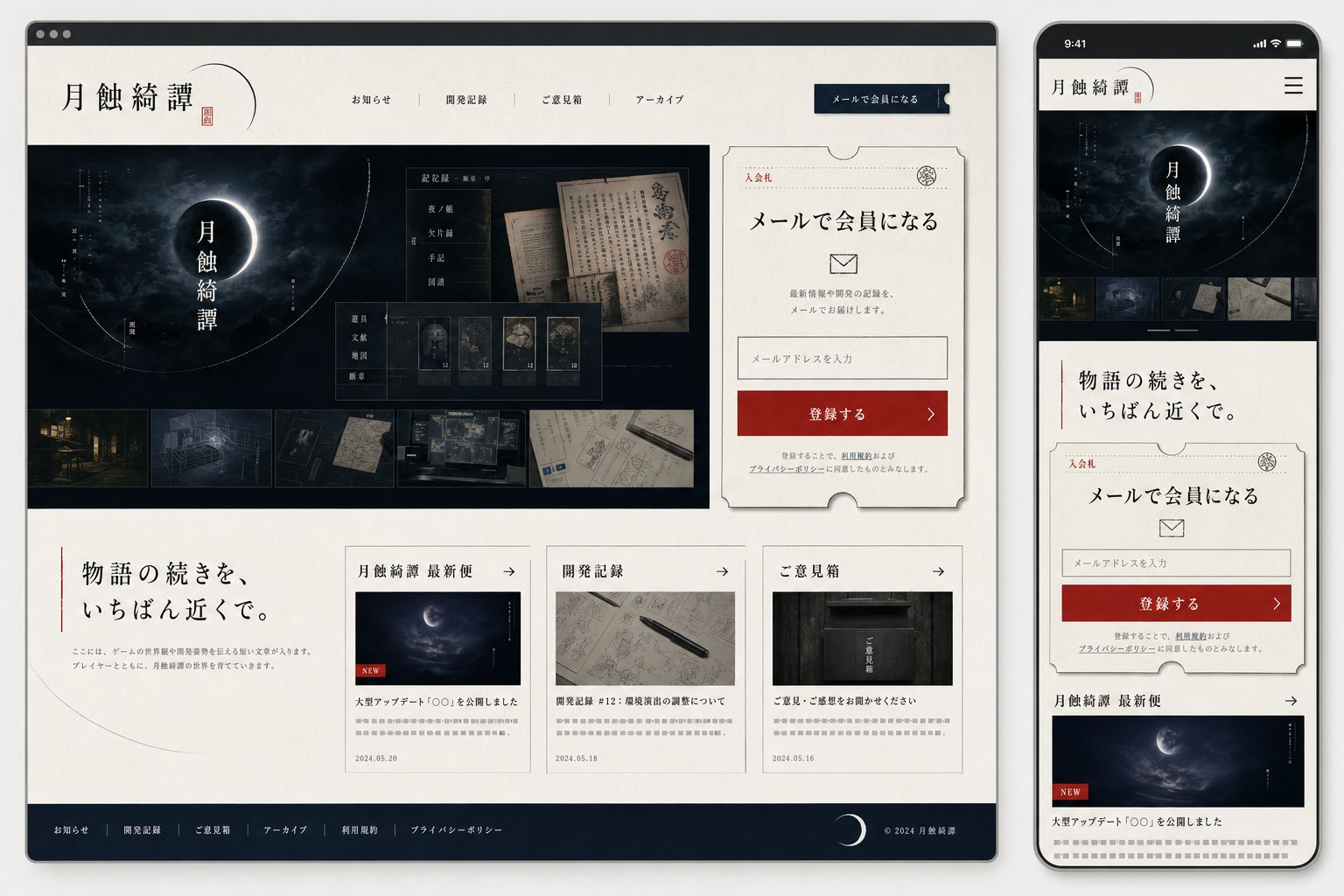
Goal: Create a polished website mockup for a Japanese mystery game or story archive titled {argument name="site title" default="月蝕綺譚"}, shown as a responsive design preview with one desktop browser window on the left and one smartphone screen on the right.

Canvas: Wide 16:9 presentation image on a light gray background. Place a large desktop browser mockup occupying about 75% of the width on the left, and a tall smartphone mockup occupying about 22% of the width on the right. Use realistic device frames with soft shadows.

Visual style: Elegant Japanese literary horror, quiet mystery, archival documents, moonlit darkness. Palette of ivory paper, black ink, deep navy-black, muted gray, and one strong vermilion red accent. Use serif Japanese typography, thin ruled lines, ticket-like borders, subtle paper texture, old manuscript imagery, and faint crescent-orbit line graphics. The overall mood should feel like a premium official website for a narrative game.

Desktop layout: Show a browser window with a dark top bar and three small window dots. Inside the page, use an ivory header with the site title {argument name="site title" default="月蝕綺譚"} on the left, a small red seal mark, and exactly 5 horizontal navigation items: 「お知らせ」, 「開発記録」, 「ご意見箱」, 「アーカイブ」, and a dark navy button labeled 「メールで会員になる」. The hero section below is a wide dark moon-eclipse visual with the vertical title 「月蝕綺譚」 centered over a glowing crescent/eclipse. Overlay a translucent archive UI card with old Japanese documents and exactly 5 small collectible/document cards along the bottom of that overlay. Along the very bottom of the hero image, include exactly 5 horizontal thumbnail strips showing: a night street, a blueprint-like room, a dark folder or object, old handwritten papers, and a desk/workspace map.

Desktop right signup card: To the right of the hero, place a large cream ticket-shaped membership card with clipped semicircle notches and a thin decorative border. It includes the small label 「入会札」, a stamp emblem, headline 「メールで会員になる」, an envelope icon, short explanatory text, one email input field with placeholder 「メールアドレスを入力」, and a red CTA button labeled 「登録する」 with a right arrow. Include tiny privacy-policy text beneath.

Desktop lower content: Under the hero, make a two-column-feeling section. On the left, a large Japanese tagline {argument name="tagline text" default="物語の続きを、いちばん近くで。"} with a thin vertical red line and a small descriptive paragraph. On the right, place exactly 3 article cards in a row. The 3 cards are: 1) 「月蝕綺譚 最新便」 with a moon image, a small red NEW label, title 「大型アップデート『○○』を公開しました」, date 2024.05.20; 2) 「開発記録」 with a notebook and pen image, title 「開発記録 #12:環境音の調整について」, date 2024.05.18; 3) 「ご意見箱」 with a dark mailbox image, title 「ご意見・ご感想をお聞かせください」, date 2024.05.16. Each card has a thin border, a small arrow in the header, and gray placeholder summary lines.

Desktop footer: Add a dark navy footer spanning the bottom with exactly 6 footer links: 「お知らせ」, 「開発記録」, 「ご意見箱」, 「アーカイブ」, 「利用規約」, 「プライバシーポリシー」. Include a crescent moon icon and copyright 「© 2024 月蝕綺譚」 on the right.

Mobile layout: On the right smartphone, show the same site adapted to mobile. Status bar time reads 9:41. Header contains the title 「月蝕綺譚」 and a hamburger menu icon. Below it, show a compact dark hero with the eclipse and vertical title, then exactly 5 small horizontal thumbnails. Continue with the tagline 「物語の続きを、いちばん近くで。」, then the same ticket-shaped email signup card, then the first news card 「月蝕綺譚 最新便」 with moon image and red NEW label. The mobile view should be vertically scrollable-looking but contained within the phone screen.

Constraints: Keep all visible interface text in Japanese as specified. Use clean, high-fidelity UI mockup rendering, crisp typography, subtle shadows, and no extra logos or watermarks. The design should look like a finished web/app mock generated for implementation planning.
Translations
日式悬疑网站原型设计
enGoal: Create a polished website mockup for a Japanese mystery game or story archive titled {argument name="site title" default="月蝕綺譚"}, shown as a responsive design preview with one desktop browser window on the left and one smartphone screen on the right. Canvas: Wide 16:9 presentation image on a light gray background. Place a large desktop browser mockup occupying about 75% of the width on the left, and a tall smartphone mockup occupying about 22% of the width on the right. Use realistic device frames with soft shadows. Visual style: Elegant Japanese literary horror, quiet mystery, archival documents, moonlit darkness. Palette of ivory paper, black ink, deep navy-black, muted gray, and one strong vermilion red accent. Use serif Japanese typography, thin ruled lines, ticket-like borders, subtle paper texture, old manuscript imagery, and faint crescent-orbit line graphics. The overall mood should feel like a premium official website for a narrative game. Desktop layout: Show a browser window with a dark top bar and three small window dots. Inside the page, use an ivory header with the site title {argument name="site title" default="月蝕綺譚"} on the left, a small red seal mark, and exactly 5 horizontal navigation items: 「お知らせ」, 「開発記録」, 「ご意見箱」, 「アーカイブ」, and a dark navy button labeled 「メールで会員になる」. The hero section below is a wide dark moon-eclipse visual with the vertical title 「月蝕綺譚」 centered over a glowing crescent/eclipse. Overlay a translucent archive UI card with old Japanese documents and exactly 5 small collectible/document cards along the bottom of that overlay. Along the very bottom of the hero image, include exactly 5 horizontal thumbnail strips showing: a night street, a blueprint-like room, a dark folder or object, old handwritten papers, and a desk/workspace map. Desktop right signup card: To the right of the hero, place a large cream ticket-shaped membership card with clipped semicircle notches and a thin decorative border. It includes the small label 「入会札」, a stamp emblem, headline 「メールで会員になる」, an envelope icon, short explanatory text, one email input field with placeholder 「メールアドレスを入力」, and a red CTA button labeled 「登録する」 with a right arrow. Include tiny privacy-policy text beneath. Desktop lower content: Under the hero, make a two-column-feeling section. On the left, a large Japanese tagline {argument name="tagline text" default="物語の続きを、いちばん近くで。"} with a thin vertical red line and a small descriptive paragraph. On the right, place exactly 3 article cards in a row. The 3 cards are: 1) 「月蝕綺譚 最新便」 with a moon image, a small red NEW label, title 「大型アップデート『○○』を公開しました」, date 2024.05.20; 2) 「開発記録」 with a notebook and pen image, title 「開発記録 #12:環境音の調整について」, date 2024.05.18; 3) 「ご意見箱」 with a dark mailbox image, title 「ご意見・ご感想をお聞かせください」, date 2024.05.16. Each card has a thin border, a small arrow in the header, and gray placeholder summary lines. Desktop footer: Add a dark navy footer spanning the bottom with exactly 6 footer links: 「お知らせ」, 「開発記録」, 「ご意見箱」, 「アーカイブ」, 「利用規約」, 「プライバシーポリシー」. Include a crescent moon icon and copyright 「© 2024 月蝕綺譚」 on the right. Mobile layout: On the right smartphone, show the same site adapted to mobile. Status bar time reads 9:41. Header contains the title 「月蝕綺譚」 and a hamburger menu icon. Below it, show a compact dark hero with the eclipse and vertical title, then exactly 5 small horizontal thumbnails. Continue with the tagline 「物語の続きを、いちばん近くで。」, then the same ticket-shaped email signup card, then the first news card 「月蝕綺譚 最新便」 with moon image and red NEW label. The mobile view should be vertically scrollable-looking but contained within the phone screen. Constraints: Keep all visible interface text in Japanese as specified. Use clean, high-fidelity UI mockup rendering, crisp typography, subtle shadows, and no extra logos or watermarks. The design should look like a finished web/app mock generated for implementation planning.
日式悬疑网站原型设计
zh-CN目标:为名为 {argument name="site title" default="月蝕綺譚"} 的日式悬疑游戏或故事存档网站创建一个精致的网站原型,并以响应式设计预览呈现,左侧为桌面浏览器窗口,右侧为智能手机屏幕。 画布:宽屏 16:9 的展示图,背景为浅灰色。左侧放置一个占据约 75% 宽度的桌面浏览器原型,右侧放置一个占据约 22% 宽度的竖向智能手机原型。使用带有柔和阴影的真实设备边框。 视觉风格:优雅的日式文学恐怖、静谧悬疑、档案文献、月光下的黑暗。配色方案包含象牙白纸张色、墨黑色、深海军蓝、柔和灰,以及一处强烈的朱红色点缀。使用日式衬线字体、细横线、票据式边框、细腻的纸张纹理、旧手稿图像以及淡淡的新月轨道线条图形。整体氛围应如同叙事游戏的官方高端网站。 桌面端布局:展示一个带有深色顶部栏和三个小窗口圆点的浏览器窗口。页面内部使用象牙白页眉,左侧显示网站标题 {argument name="site title" default="月蝕綺譚"}、一个小红印章,以及 5 个水平导航项:「お知らせ」、「開発記録」、「ご意見箱」、「アーカイブ」以及一个标有「メールで会員になる」的深海军蓝按钮。下方的首屏区域是一个宽幅的深色月食视觉图,垂直标题「月蝕綺譚」居中于发光的月牙/月食之上。叠加一张半透明的档案 UI 卡片,展示旧日式文档,并在叠加层底部放置 5 张小型收藏/文档卡片。在首屏图像的最底部,包含 5 个水平缩略图条,分别展示:夜间街道、蓝图风格房间、深色文件夹或物体、旧手写纸张以及桌面/工作区地图。 桌面端右侧注册卡片:在首屏右侧,放置一张带有半圆形切口和细装饰边框的大型奶油色票据式会员卡。包含小标签「入会札」、印章标志、标题「メールで会員になる」、信封图标、简短说明文字、一个带有占位符「メールアドレスを入力」的电子邮件输入框,以及一个标有「登録する」并带有向右箭头的红色 CTA 按钮。下方包含微小的隐私政策文本。 桌面端下方内容:在首屏下方,创建一个双栏布局感区域。左侧为大型日式标语 {argument name="tagline text" default="物語の続きを、いちばん近くで。"},配有一条细垂直红线和一个简短的描述段落。右侧并排放置 3 张文章卡片。这 3 张卡片分别为:1) 「月蝕綺譚 最新便」,配有月亮图像、红色 NEW 小标签、标题「大型アップデート『○○』を公開しました」、日期 2024.05.20;2) 「開発記録」,配有笔记本和笔的图像、标题「開発記録 #12:環境音の調整について」、日期 2024.05.18;3) 「ご意見箱」,配有深色邮箱图像、标题「ご意見・ご感想をお聞かせください」、日期 2024.05.16。每张卡片都有细边框、标题栏中的小箭头以及灰色占位符摘要行。 桌面端页脚:在底部添加一个深海军蓝页脚,包含 6 个页脚链接:「お知らせ」、「開発記録」、「ご意見箱」、「アーカイブ」、「利用規約」、「プライバシーポリシー」。右侧包含一个月牙图标和版权信息「© 2024 月蝕綺譚」。 移动端布局:在右侧的智能手机上,展示适配移动端的同一网站。状态栏时间显示 9:41。页眉包含标题「月蝕綺譚」和一个汉堡菜单图标。下方展示一个紧凑的深色首屏,包含月食和垂直标题,然后是 5 个小型水平缩略图。接着是标语「物語の続きを、いちばん近くで。」,然后是同样的票据式电子邮件注册卡片,随后是第一条新闻卡片「月蝕綺譚 最新便」(带月亮图像和红色 NEW 标签)。移动端视图应呈现为可垂直滚动,但限制在手机屏幕内。 约束:所有可见的界面文本均按指定使用日语。使用清晰、高保真的 UI 原型渲染、锐利的排版、柔和的阴影,且不添加额外的徽标或水印。设计应看起来像是为实施规划而生成的成品网页/应用原型。