日式悬疑游戏网站模型
生成一个响应式桌面端和移动端落地页模型,用于优雅的日式哥特悬疑游戏通讯网站。
- Category
- Charts & Infographics
- Model
- GPT Image 2
- Creator
- Masa/マーケティング×生成AIの「株式会社ユーダイモニア」代表
- Source language
- en
- Source ID
- 28421
- Published
- Jul 11, 2026
Full prompt
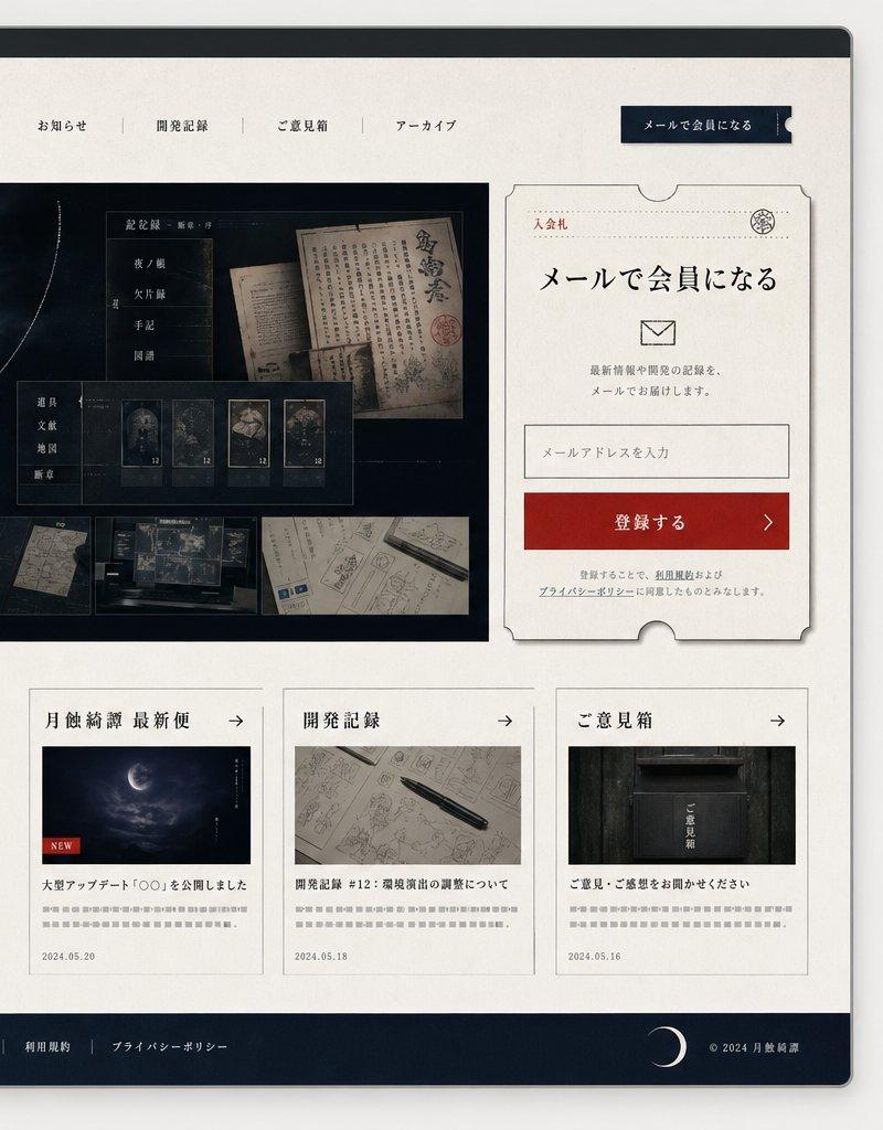
Goal: Create a polished responsive website mockup for a Japanese mystery / horror game community called {argument name="site title" default="月蝕綺譚"}, shown as both a desktop browser window and a smartphone screen side by side.

Canvas: 16:9 presentation image on a light gray background. Place a large desktop browser mockup on the left, occupying about 75% of the width, and a tall smartphone mockup on the right. Use soft shadows, rounded device corners, and realistic UI framing.

Visual style: Elegant Japanese gothic mystery aesthetic, off-white washi-paper texture backgrounds, deep navy-black panels, thin gray borders, muted red accents, refined serif Japanese typography, subtle ink-like lines, crescent moon motifs, archival documents, old maps, dark forest/night imagery, and restrained premium web-design spacing.

Desktop layout: A browser window with a dark top chrome bar and three small circular window buttons. Header contains the site title logo 「月蝕綺譚」 on the left with a thin crescent arc and red seal mark, 4 centered navigation links labeled 「お知らせ」, 「開発記録」, 「ご意見箱」, 「アーカイブ」, and a dark navy call-to-action button on the right labeled 「メールで会員になる」. Below, create a hero section split into a large dark image area on the left and a signup card on the right. The hero image shows a cloudy night sky with a glowing eclipsed crescent moon and vertical title text 「月蝕綺譚」, with fine circular orbit lines and small vertical annotations. Overlay a translucent archive-style panel containing old Japanese documents and 5 small thumbnail cards; along the bottom of the hero image include exactly 5 horizontal thumbnail images: an old building at night, a blueprint-like room drawing, a dark symbolic detail, handwritten documents, and a desk with maps/screens.

Signup card: On the right of the desktop hero, create a cream ticket-shaped card with notched edges, thin border, small red label 「入会札」, headline 「メールで会員になる」, an envelope icon, short explanatory copy, one email input field with placeholder 「メールアドレスを入力」, and a red button labeled 「登録する」 with a right arrow. Add small privacy-policy style text beneath.

Desktop lower content: Under the hero, place a large intro message on the left with a vertical red line and headline {argument name="intro headline" default="物語の続きを、いちばん近くで。"}, plus small gray body copy. To the right, place exactly 3 article cards in a row. Card 1 title section 「月蝕綺譚 最新便」 with a moon image, red NEW tag, headline 「大型アップデート『〇〇』を公開しました」, date 2024.05.20. Card 2 title section 「開発記録」 with a notebook and pen image, headline 「開発記録 #12:環境演出の調整について」, date 2024.05.18. Card 3 title section 「ご意見箱」 with a dark mailbox image, headline 「ご意見・ご感想をお聞かせください」, date 2024.05.16. Each card has a small right arrow in the header and gray teaser lines.

Footer: Dark navy footer spanning the desktop width with exactly 6 links: 「お知らせ」, 「開発記録」, 「ご意見箱」, 「アーカイブ」, 「利用規約」, 「プライバシーポリシー」. Add a crescent moon icon near the right and copyright text 「© 2024 月蝕綺譚」.

Mobile layout: Show a smartphone preview of the same site. Top status bar reads 9:41, followed by a compact header with 「月蝕綺譚」 logo and a hamburger menu icon. The mobile page stacks vertically: hero moon image with title, exactly 5 small thumbnails in a horizontal strip, intro headline 「物語の続きを、いちばん近くで。」, the same ticket-style email signup card, then the first news card 「月蝕綺譚 最新便」 with the moon image and NEW tag. Ensure all elements feel like the mobile-responsive version of the desktop layout.

Constraints: Use only Japanese text where specified, keep typography crisp and legible, avoid extra sections beyond those described, preserve the exact counts of 4 desktop nav links, 5 hero thumbnails, 3 desktop article cards, 6 footer links, and 1 mobile hamburger menu.Translations2
日式悬疑游戏网站模型
zh-CN目标:为名为 {argument name="site title" default="月蝕綺譚"} 的日式悬疑/恐怖游戏社区创建一个精致的响应式网站模型,并排展示桌面浏览器窗口和智能手机屏幕。 画布:浅灰色背景上的 16:9 展示图。左侧放置一个占据约 75% 宽度的桌面浏览器模型,右侧放置一个纵向的智能手机模型。使用柔和阴影、圆角设备边框和逼真的 UI 框架。 视觉风格:优雅的日式哥特悬疑美学,米白色和纸纹理背景,深藏青色面板,细灰色边框,柔和的红色点缀,精致的日文衬线字体,细腻的墨迹线条,新月图案,档案文件,古地图,暗黑森林/夜景意象,以及克制的优质网页设计间距。 桌面布局:浏览器窗口顶部带有深色工具栏和三个小型圆形窗口按钮。页眉左侧包含网站标题 Logo 「月蝕綺譚」,带有细长的新月弧线和红色印章标记;中间包含 4 个导航链接,分别为 「お知らせ」、「開発記録」、「ご意見箱」、「アーカイブ」;右侧为一个深藏青色的行动号召按钮,标注为 「メールで会員になる」。下方创建一个首屏区域,左侧为大型深色图像区,右侧为注册卡片。首屏图像展示了阴云密布的夜空,带有发光的新月蚀和垂直标题文字 「月蝕綺譚」,并配有精细的圆形轨道线和小型垂直注释。叠加一个半透明的档案风格面板,包含旧日式文件和 5 张小型缩略图卡片;在首屏图像底部包含 5 张水平排列的缩略图:深夜的古建筑、蓝图风格的房间绘图、深色象征性细节、手写文档以及带有地图/屏幕的桌面。 注册卡片:在桌面端首屏右侧,创建一个带有缺口的奶油色票据形卡片,配有细边框、小型红色标签 「入会札」、标题 「メールで会員になる」、信封图标、简短说明文案、一个带有占位符 「メールアドレスを入力」 的电子邮件输入框,以及一个标注为 「登録する」 并带有向右箭头的红色按钮。下方添加小型隐私政策风格文本。 桌面端下方内容:在首屏下方,左侧放置一段大型介绍信息,配有垂直红线和标题 {argument name="intro headline" default="物語の続きを、いちばん近くで。"},以及小型灰色正文。右侧并排放置 3 张文章卡片。卡片 1 标题区为 「月蝕綺譚 最新便」,配有月亮图像、红色 NEW 标签、标题 「大型アップデート『〇〇』を公開しました」、日期 2024.05.20。卡片 2 标题区为 「開発記録」,配有笔记本和笔的图像、标题 「開発記録 #12:環境演出の調整について」、日期 2024.05.18。卡片 3 标题区为 「ご意見箱」,配有深色邮箱图像、标题 「ご意見・ご感想をお聞かせください」、日期 2024.05.16。每张卡片标题栏均有一个向右的小箭头和灰色摘要行。 页脚:深藏青色页脚横跨桌面宽度,包含 6 个链接: 「お知らせ」、「開発記録」、「ご意見箱」、「アーカイブ」、「利用規約」、「プライバシーポリシー」。在右侧附近添加一个新月图标,并标注版权文字 「© 2024 月蝕綺譚」。 移动端布局:展示同一网站的智能手机预览。顶部状态栏显示 9:41,随后是包含 「月蝕綺譚」 Logo 和汉堡菜单图标的紧凑型页眉。移动端页面垂直堆叠:首屏月亮图像及标题、水平排列的 5 张小型缩略图、介绍标题 「物語の続きを、いちばん近くで。」、与桌面端相同的票据式电子邮件注册卡片,随后是第一条新闻卡片 「月蝕綺譚 最新便」(含月亮图像和 NEW 标签)。确保所有元素均呈现为桌面端布局的移动响应版本。 约束:仅在指定位置使用日文文本,保持排版清晰易读,避免添加描述之外的额外部分,严格保留 4 个桌面端导航链接、5 张首屏缩略图、3 张桌面端文章卡片、6 个页脚链接以及 1 个移动端汉堡菜单的准确数量。
日式悬疑游戏网站模型
enGoal: Create a polished responsive website mockup for a Japanese mystery / horror game community called {argument name="site title" default="月蝕綺譚"}, shown as both a desktop browser window and a smartphone screen side by side. Canvas: 16:9 presentation image on a light gray background. Place a large desktop browser mockup on the left, occupying about 75% of the width, and a tall smartphone mockup on the right. Use soft shadows, rounded device corners, and realistic UI framing. Visual style: Elegant Japanese gothic mystery aesthetic, off-white washi-paper texture backgrounds, deep navy-black panels, thin gray borders, muted red accents, refined serif Japanese typography, subtle ink-like lines, crescent moon motifs, archival documents, old maps, dark forest/night imagery, and restrained premium web-design spacing. Desktop layout: A browser window with a dark top chrome bar and three small circular window buttons. Header contains the site title logo 「月蝕綺譚」 on the left with a thin crescent arc and red seal mark, 4 centered navigation links labeled 「お知らせ」, 「開発記録」, 「ご意見箱」, 「アーカイブ」, and a dark navy call-to-action button on the right labeled 「メールで会員になる」. Below, create a hero section split into a large dark image area on the left and a signup card on the right. The hero image shows a cloudy night sky with a glowing eclipsed crescent moon and vertical title text 「月蝕綺譚」, with fine circular orbit lines and small vertical annotations. Overlay a translucent archive-style panel containing old Japanese documents and 5 small thumbnail cards; along the bottom of the hero image include exactly 5 horizontal thumbnail images: an old building at night, a blueprint-like room drawing, a dark symbolic detail, handwritten documents, and a desk with maps/screens. Signup card: On the right of the desktop hero, create a cream ticket-shaped card with notched edges, thin border, small red label 「入会札」, headline 「メールで会員になる」, an envelope icon, short explanatory copy, one email input field with placeholder 「メールアドレスを入力」, and a red button labeled 「登録する」 with a right arrow. Add small privacy-policy style text beneath. Desktop lower content: Under the hero, place a large intro message on the left with a vertical red line and headline {argument name="intro headline" default="物語の続きを、いちばん近くで。"}, plus small gray body copy. To the right, place exactly 3 article cards in a row. Card 1 title section 「月蝕綺譚 最新便」 with a moon image, red NEW tag, headline 「大型アップデート『〇〇』を公開しました」, date 2024.05.20. Card 2 title section 「開発記録」 with a notebook and pen image, headline 「開発記録 #12:環境演出の調整について」, date 2024.05.18. Card 3 title section 「ご意見箱」 with a dark mailbox image, headline 「ご意見・ご感想をお聞かせください」, date 2024.05.16. Each card has a small right arrow in the header and gray teaser lines. Footer: Dark navy footer spanning the desktop width with exactly 6 links: 「お知らせ」, 「開発記録」, 「ご意見箱」, 「アーカイブ」, 「利用規約」, 「プライバシーポリシー」. Add a crescent moon icon near the right and copyright text 「© 2024 月蝕綺譚」. Mobile layout: Show a smartphone preview of the same site. Top status bar reads 9:41, followed by a compact header with 「月蝕綺譚」 logo and a hamburger menu icon. The mobile page stacks vertically: hero moon image with title, exactly 5 small thumbnails in a horizontal strip, intro headline 「物語の続きを、いちばん近くで。」, the same ticket-style email signup card, then the first news card 「月蝕綺譚 最新便」 with the moon image and NEW tag. Ensure all elements feel like the mobile-responsive version of the desktop layout. Constraints: Use only Japanese text where specified, keep typography crisp and legible, avoid extra sections beyond those described, preserve the exact counts of 4 desktop nav links, 5 hero thumbnails, 3 desktop article cards, 6 footer links, and 1 mobile hamburger menu.