日式集换式卡牌 (TCG) 策略信息图
生成一张暗黑奇幻风格的日式集换式卡牌分析信息图,对比将某张卡牌加入卡组的优缺点。
- Category
- Charts & Infographics
- Model
- GPT Image 2
- Creator
- やぐち+
- Source language
- en
- Source ID
- 28539
- Published
- Jul 12, 2026
Full prompt
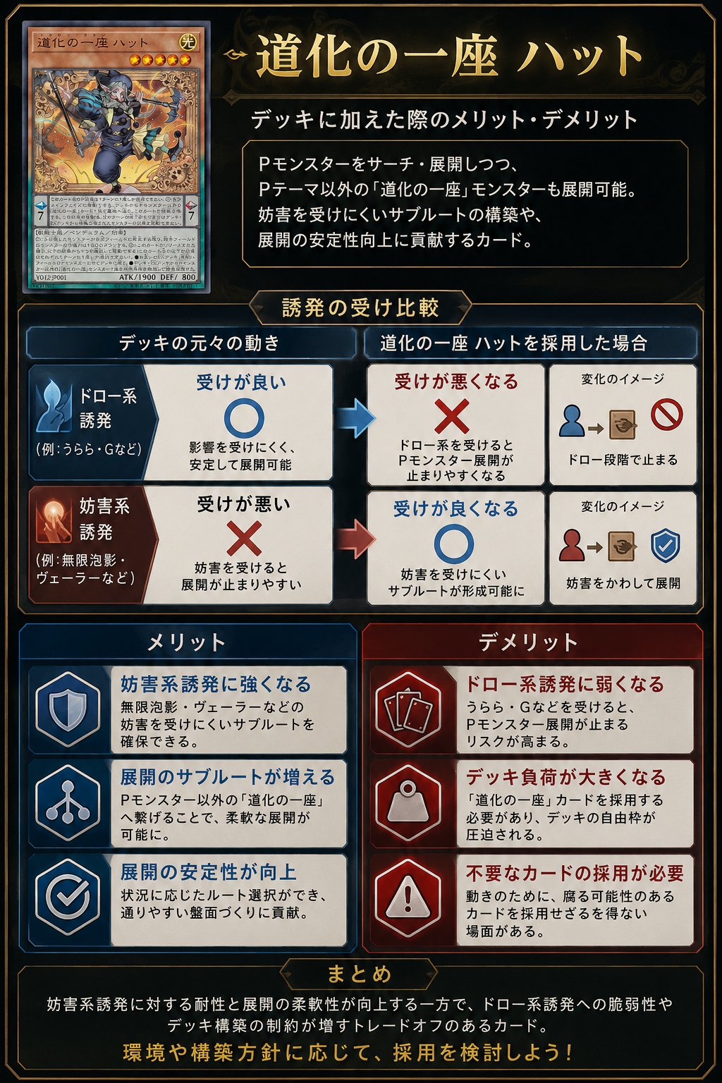
Goal: Create a polished vertical Japanese trading-card-game strategy infographic explaining the pros and cons of adding a specific card to a deck.

Canvas: Portrait 2:3 layout, dark navy-black fantasy UI background with thin gold ornamental borders, beveled panels, subtle glow, and a premium card-game analysis aesthetic. Use gold title typography and white Japanese body text.

Main title area: At top right, place a large ornate gold headline reading {argument name="headline text" default="道化の一座 ハット"}. Beneath it, add the subtitle {argument name="subtitle text" default="デッキに加えた際のメリット・デメリット"}. Under the subtitle, place a dark framed explanation box containing 3 short Japanese lines describing that the card can search/deploy Pendulum monsters, also enables non-theme monsters, supports interruption-resistant subroutes, and improves combo stability.

Card display: At top left, show exactly 1 realistic Yu-Gi-Oh-style monster card mockup, named {argument name="card name" default="道化の一座 ハット"}. The card should have an orange monster-card frame, star icons, a small LIGHT attribute icon, dense Japanese effect text, ATK/DEF line, and fantasy artwork of a jester-like rogue in blue clothing holding a staff amid swirling golden magic. Do not use official logos or exact copyrighted card layout details; make it a close fictional TCG-style homage.

Middle comparison section: Add a centered gold label tab reading “Trigger resilience comparison”. Create exactly 2 horizontal comparison rows under it, each split into a left original-deck behavior column, a middle after-adoption result column, and a right small change-image column. Row 1 is draw-type trigger: blue icon, left box has a large blue circle meaning good resilience; arrow points right to a red X meaning resilience becomes worse; right mini diagram shows a blue person icon leading to a card/box and a prohibition symbol, implying the combo stops at the draw stage. Row 2 is interruption-type trigger: red/orange icon, left box has a large red X meaning poor resilience; arrow points right to a blue circle meaning resilience improves; right mini diagram shows a red person icon leading to a card/box and a blue shield check, implying interruption is avoided and deployment continues.

Lower benefits and drawbacks: Create exactly 6 rectangular cards in two columns, 3 benefits on the left and 3 drawbacks on the right. Left column header: “メリット” in a blue panel. Right column header: “デメリット” in a red panel. Benefit card 1 uses a shield icon and says it becomes stronger against interruption-type triggers. Benefit card 2 uses a branching route icon and says the number of deployment subroutes increases. Benefit card 3 uses a checkmark icon and says combo stability improves. Drawback card 1 uses stacked card icons and says it becomes weaker against draw-type triggers. Drawback card 2 uses a weight/bag icon and says deck burden becomes larger. Drawback card 3 uses a warning triangle icon and says unnecessary cards may need to be adopted. Each of the 6 cards must include a bold colored heading plus two smaller Japanese explanatory lines.

Bottom summary: Add a wide dark framed box with a small gold tab header reading “まとめ”. Inside, write a concise Japanese summary explaining the trade-off: resistance to interruption and flexible deployment improve, but weakness to draw-type triggers and deck-building constraints increase. End with a larger gold call-to-action line reading {argument name="closing line" default="環境や構築方針に応じて、採用を検討しよう!"}.

Style constraints: Use crisp vector-like UI panels mixed with realistic card art, high contrast, clean alignment, thin gold borders, blue for positive elements, red for negative elements, arrows between comparison boxes, no watermark, no extra sections, and keep all text legible as an infographic.
Translations
日式集换式卡牌 (TCG) 策略信息图
enGoal: Create a polished vertical Japanese trading-card-game strategy infographic explaining the pros and cons of adding a specific card to a deck. Canvas: Portrait 2:3 layout, dark navy-black fantasy UI background with thin gold ornamental borders, beveled panels, subtle glow, and a premium card-game analysis aesthetic. Use gold title typography and white Japanese body text. Main title area: At top right, place a large ornate gold headline reading {argument name="headline text" default="道化の一座 ハット"}. Beneath it, add the subtitle {argument name="subtitle text" default="デッキに加えた際のメリット・デメリット"}. Under the subtitle, place a dark framed explanation box containing 3 short Japanese lines describing that the card can search/deploy Pendulum monsters, also enables non-theme monsters, supports interruption-resistant subroutes, and improves combo stability. Card display: At top left, show exactly 1 realistic Yu-Gi-Oh-style monster card mockup, named {argument name="card name" default="道化の一座 ハット"}. The card should have an orange monster-card frame, star icons, a small LIGHT attribute icon, dense Japanese effect text, ATK/DEF line, and fantasy artwork of a jester-like rogue in blue clothing holding a staff amid swirling golden magic. Do not use official logos or exact copyrighted card layout details; make it a close fictional TCG-style homage. Middle comparison section: Add a centered gold label tab reading “Trigger resilience comparison”. Create exactly 2 horizontal comparison rows under it, each split into a left original-deck behavior column, a middle after-adoption result column, and a right small change-image column. Row 1 is draw-type trigger: blue icon, left box has a large blue circle meaning good resilience; arrow points right to a red X meaning resilience becomes worse; right mini diagram shows a blue person icon leading to a card/box and a prohibition symbol, implying the combo stops at the draw stage. Row 2 is interruption-type trigger: red/orange icon, left box has a large red X meaning poor resilience; arrow points right to a blue circle meaning resilience improves; right mini diagram shows a red person icon leading to a card/box and a blue shield check, implying interruption is avoided and deployment continues. Lower benefits and drawbacks: Create exactly 6 rectangular cards in two columns, 3 benefits on the left and 3 drawbacks on the right. Left column header: “メリット” in a blue panel. Right column header: “デメリット” in a red panel. Benefit card 1 uses a shield icon and says it becomes stronger against interruption-type triggers. Benefit card 2 uses a branching route icon and says the number of deployment subroutes increases. Benefit card 3 uses a checkmark icon and says combo stability improves. Drawback card 1 uses stacked card icons and says it becomes weaker against draw-type triggers. Drawback card 2 uses a weight/bag icon and says deck burden becomes larger. Drawback card 3 uses a warning triangle icon and says unnecessary cards may need to be adopted. Each of the 6 cards must include a bold colored heading plus two smaller Japanese explanatory lines. Bottom summary: Add a wide dark framed box with a small gold tab header reading “まとめ”. Inside, write a concise Japanese summary explaining the trade-off: resistance to interruption and flexible deployment improve, but weakness to draw-type triggers and deck-building constraints increase. End with a larger gold call-to-action line reading {argument name="closing line" default="環境や構築方針に応じて、採用を検討しよう!"}. Style constraints: Use crisp vector-like UI panels mixed with realistic card art, high contrast, clean alignment, thin gold borders, blue for positive elements, red for negative elements, arrows between comparison boxes, no watermark, no extra sections, and keep all text legible as an infographic.
日式集换式卡牌 (TCG) 策略信息图
zh-CN目标:制作一张精致的竖版日式集换式卡牌策略信息图,阐述将特定卡牌加入卡组的利弊。 画布:2:3 纵向布局,深海军蓝/黑色奇幻 UI 背景,配有纤细的金色装饰边框、斜面面板、微光效果以及高级卡牌游戏分析美学。标题使用金色字体,正文使用白色日文。 主标题区:在右上角放置一个醒目的华丽金色标题 {argument name="headline text" default="道化の一座 ハット"}。在标题下方添加副标题 {argument name="subtitle text" default="デッキに加えた際のメリット・デメリット"}。在副标题下方,放置一个深色边框的说明框,包含 3 行简短的日文,描述该卡牌可以检索/部署灵摆怪兽,支持非本家怪兽,支持抗干扰的次要路线,并提高连招稳定性。 卡牌展示:在左上角展示 1 张逼真的游戏王风格怪兽卡模型,命名为 {argument name="card name" default="道化の一座 ハット"}。卡牌应具有橙色怪兽卡边框、星级图标、小型光属性图标、密集的日文效果文本、攻击力/守备力数值,以及身着蓝色服装、手持法杖、周围环绕金色魔法的弄臣风格盗贼的奇幻插画。请勿使用官方标志或完全照搬受版权保护的卡牌布局;制作一个接近虚构 TCG 风格的致敬设计。 中部对比区:添加一个居中的金色标签,文字为“Trigger resilience comparison”。在其下方创建 2 行水平对比行,每行分为左侧“原始卡组行为”列、中间“采用后结果”列和右侧“小型变化图示”列。第 1 行为抽卡型触发器:蓝色图标,左侧框内有一个大蓝色圆圈表示抗性良好;箭头指向右侧的红色 X,表示抗性变差;右侧迷你图显示蓝色人物图标指向卡牌/盒子并带有禁止符号,暗示连招在抽卡阶段停止。第 2 行为干扰型触发器:红/橙色图标,左侧框内有一个大红色 X 表示抗性较差;箭头指向右侧的蓝色圆圈,表示抗性改善;右侧迷你图显示红色人物图标指向卡牌/盒子并带有蓝色盾牌勾选,暗示避开了干扰并继续部署。 下方利弊分析:创建 6 张矩形卡片,分为两列,左侧 3 个优点,右侧 3 个缺点。左列标题:“メリット”(蓝色面板)。右列标题:“デメリット”(红色面板)。优点卡 1 使用盾牌图标,说明对干扰型触发器的抗性增强。优点卡 2 使用分支路线图标,说明部署的次要路线数量增加。优点卡 3 使用勾选图标,说明连招稳定性提高。缺点卡 1 使用堆叠卡牌图标,说明对抽卡型触发器的抗性变弱。缺点卡 2 使用重物/袋子图标,说明卡组负担加重。缺点卡 3 使用警告三角形图标,说明可能需要采用不必要的卡牌。每张卡片均需包含加粗的彩色标题以及两行较小的日文说明。 底部总结:添加一个宽大的深色边框框,配有一个小型金色标签标题“まとめ”。在框内撰写一段简洁的日文总结,解释权衡之处:对干扰的抗性和部署灵活性提高,但对抽卡型触发器的弱点和卡组构筑限制增加。最后以一行较大的金色行动号召语结尾 {argument name="closing line" default="環境や構築方針に応じて、採用を検討しよう!"}。 风格限制:使用清晰的矢量风格 UI 面板与逼真的卡牌艺术相结合,高对比度,整齐对齐,纤细的金色边框,蓝色代表正面元素,红色代表负面元素,对比框之间使用箭头,无水印,无额外部分,确保所有文字在信息图中清晰易读。