Oblique perspective typography poster: GPT Image 2 prompt
Based on the user's input [core text / word / phrase / short sentence / letters], create a high-completion 'Oblique Planar Perspective Typographic Poster.' User input: [theme text]; Text language: [Chinese / English / mixed]; Optional contextual notes: [____]; Optional emotional inclination: [____]; Optional forbidden elements: [____]. This is not an ordinary illustration, not a simple text-magnified type effect, and not a traditional flat front-facing layout. It is a modern experimental type po
- Category
- Posters & Typography
- Model
- GPT Image 2
- Creator
- Larus Canus
- Source language
- zh-CN
- Source ID
- 2048816632613453900
- Published
- Apr 27, 2026
Full prompt
Based on the user's input [core text / word / phrase / short sentence / letters], create a high-completion 'Oblique Planar Perspective Typographic Poster.'

User input: [theme text];
Text language: [Chinese / English / mixed];
Optional contextual notes: [____];
Optional emotional inclination: [____];
Optional forbidden elements: [____].

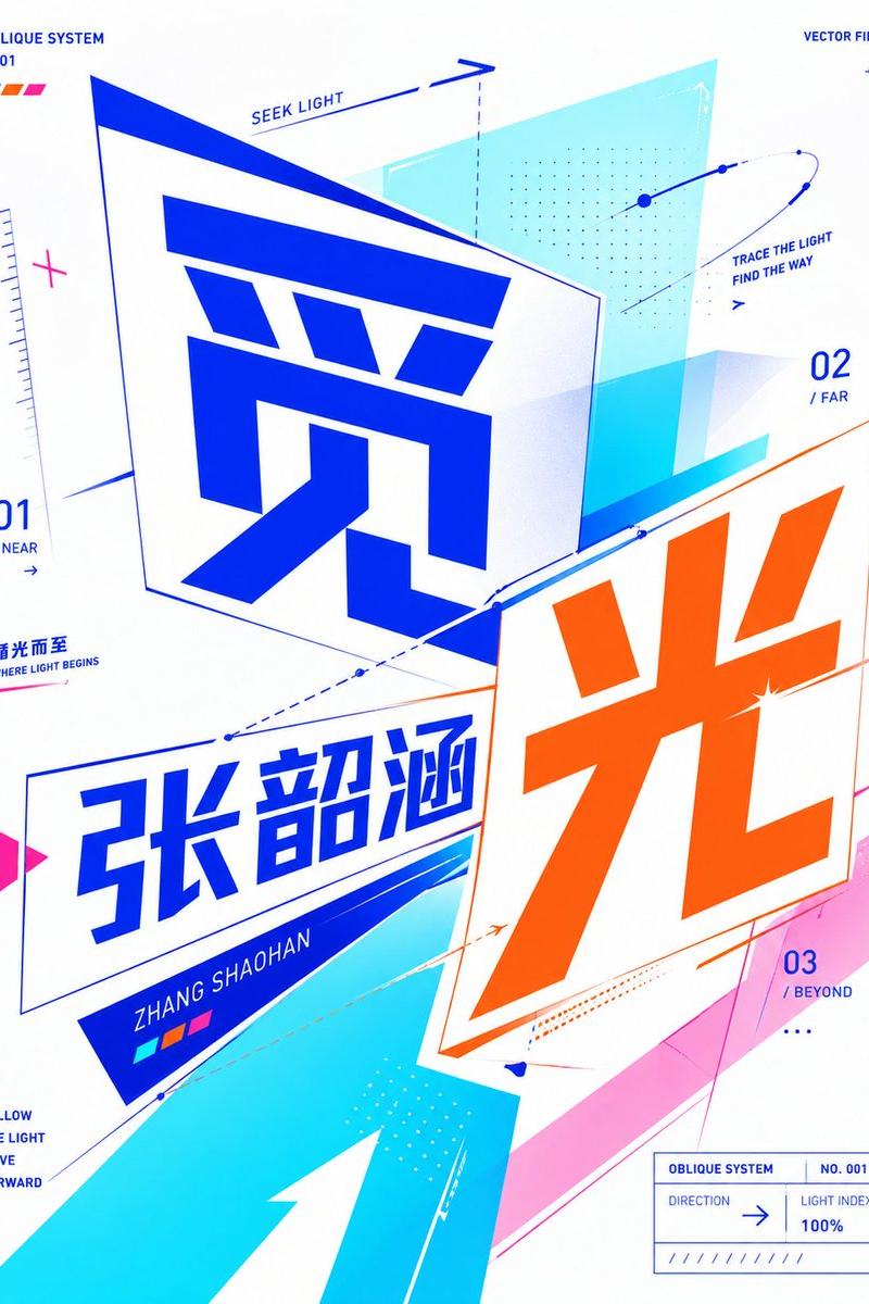
This is not an ordinary illustration, not a simple text-magnified type effect, and not a traditional flat front-facing layout. It is a modern experimental type poster with 'text as the main visual core.' The overall design must use 'Oblique Planar Perspective Typography': text should not lie completely flat on the front plane, but rather be placed as if on multiple 2D planes at different tilt angles, using oblique baselines, perspective compression, planar deflection, angled cuts, displaced compositions, vector pointing, directional lines, semi-transparent geometric planes, and modular color blocks to create a typographic system that is 'still flat design but with clear angle, spatial direction, visual tension, and vector relationships.'

First truly understand the literal meaning, emotional temperament, implicit symbolism, cultural associations, psychological feelings, and semantic tension of the user's input, then translate that understanding into a typographic poster system with 'directionality, oblique relationships, planar perspective, and visual confrontation/connection.' If the theme is more emotional, focus on expressing it through oblique text-plane distance relations, weight shifts, negative-space direction, line flow, modular density variations, and color-block compression/release. If the theme is more action-oriented, focus on oblique forward thrust, speed lines, directional arrows, perspective slices, displaced planes, and vector trajectories. If the theme is more relational, focus on the angle differences, intersection, overlap, confrontation, wrapping, cutting, and intermediary structures between multiple text subjects, geometric planes, and graphic modules. If the theme is more abstract, first find a concise abstract metaphor with strong visual translation potential, then use oblique perspective text, vector aux systems, partial occlusion, layer offsetting, modular repetition, and deformation grids to build the image.

The overall image must be a modern, sharp, bright, fashionable, experimental, viral, memorable, high-completion typographic poster. The user's text must be the primary visual subject — the core content of the entire poster. Text can be horizontal, vertical, split, displaced, grouped, recombined, partially cropped, partially occluded, nested, tilted, perspective-compressed, oblique-rotated, or even placed on different angle planes, but must always remain highly recognizable and clearly readable. Viewers must clearly feel: text is no longer flat-front, but has entered a planar spatial system composed of multiple tilted planes and directional relationships.

Emphasize these style features: text with a sense of oblique angle, near-large-far-small planar perspective, vector relationships in various directions, oblique baselines, helper arrows, geometric facets, modular forward push, partial border lines, data-feel labels, small directory-style aux notes, a few dot-arrays and path lines. Different texts or text groups can sit on different tilted planes, forming perspective differences, directional conflict, visual dialogue, or tension. Graphic elements must support text, not act as independent decoration; they should support, slice, wrap, extend the direction of text, and reinforce its oblique momentum, forming a complete visual sentence with the text.

Visual language: modern graphic design, oblique planar perspective typography, experimental typography, bold typographic composition, flat vector aesthetics, high-contrast graphic layout, contemporary editorial poster, crisp vector-like precision. Overall, this is not photographic, not retro literary, not vintage Bauhaus, not heavy-texture, not gloomy art-poster, and not a generic PowerPoint cover. It should be more contemporary, brighter, sharper, more digital, with the feel of a design-firm pitch and exhibition poster.

[New color requirements]
Colors must be bright, transparent, clear, vivid, and high-contrast — but do not default to the blue-orange combination, and don't fall into common blue-orange clashing schemes. Based on the theme's semantics, emotional temperament, and visual metaphor, automatically generate a bolder, more imaginative, fresher modern high-contrast palette. Allow unconventional combinations, jumpy colors, strong clashes, cool/warm conflicts, neon, digital, futuristic, or artistic palettes — but the whole must remain ordered, aesthetically controlled, and design-savvy.

Prioritize a '2 main colors + 1–2 accent colors + negative-space/anchor color' composition. Explore directions including but not limited to: fluorescent green + magenta + cool white; bright yellow + violet + black; lime green + deep purple + cyan-blue; rose red + cyan-green + silver white; cherry red + lake blue + pure white; mint green + bright red + deep blue; fluorescent yellow + peach + purple; coral orange + cyan-blue + white; multicolor digital splice palettes. Each generation should form a distinct color memory; do not repeat a single fixed palette or make a series of works look like the same image with different text.

Text colors should not all be pure black; let different text subjects use different highly saturated colors, or assign primary/secondary colors within the same big-text group. A small amount of dark color is allowed as a structural anchor, but the overall impression should be bright, clear, vivid, and avant-garde. Color should serve semantic expression, not just liveliness — viewers should feel the colors are 'designed,' not random piles.

Composition should be bold, oblique, with thrust and direction, while maintaining order. Suggest: 1 group of core title subjects, 1 group of oblique perspective text-plane systems, 1 group of geometric vectors and color-block structures, plus a small amount of supporting labels and dot-line markings. Leave enough negative space so high-saturation colors and oblique text have breathing room and exhibition-poster feel. Add a few small descriptions, tags, numbers, English keywords, ultra-minimalist subtitles, or short sentences to reinforce the concept, but stay restrained and don't steal focus from the main title. Aux info can mimic the annotation language of identity systems or editorial design — short words, parameters, indices, directional notes, concept tags, etc.

Fonts and layout must be modern, clear, bold, powerful, and somewhat experimental. Chinese works well with geometric sans, modern design titles, narrow-tall forms, or facet-cut forms; English works well with bold grotesk, condensed sans, geometric sans, editorial sans, etc. Allow local stretch, compression, oblique cuts, perspective deformation, slice displacement — but no real 3D extruded text, no heavy drop shadows, no real 3D modeling, no metal text, no glass text, no embossed text. Emphasize 'spatial feel within flat,' not 'physical 3D solidity.'

Graphic elements: oblique rectangles, tilted plane frames, triangle cut-outs, dot systems, arrows, path lines, thin auxiliary grids, perspective borders, directional vectors, dot-array modules, data-feel short lines, color block patches, semi-transparent geometric slices, partial circular lines, section labels, small-size index info. These elements must serve theme semantics and typographic composition, not be pure decoration.

Avoid these issues: do not make a generic flat-front type poster, traditional minimalist layout, photo or illustration realism, heavy 3D type, retro low-saturation/beige posters; do not pile unrelated graphics; do not over-decorate; do not make text unreadable; do not let the image become messy or crowded; do not let graphics disconnect from the theme; do not repeatedly default to the same color scheme.

If appropriate, auto-generate a very short subtitle or concept short sentence to support the theme, e.g., 'Between ____ and ____,' 'The tension of ____,' 'A state of ____,' 'Where ____ begins,' or a more concise Chinese phrase based on Chinese context — keep it short, restrained, designed.

Final output should be: a high-completion, modern, bright, high-contrast, flat, sharp, experimental, oblique-perspective typographic poster — readable and design-rich, with bolder freer, more imaginative colors that don't fall into a fixed blue-orange formula.
Translations2
Oblique perspective typography poster: GPT Image 2 prompt
zh-CN请基于用户输入的【核心文字 / 单词 / 词组 / 短句 / 字母】,创作一张高完成度的「斜向透视平面字体概念海报 / Oblique Planar Perspective Typographic Poster」。 用户输入:[主题文字]; 文字语言:[中文 / 英文 / 中英混排]; 可选补充语境:[____]; 可选情绪倾向:[____]; 可选禁用元素:[____]。 这不是普通插画,不是简单把文字放大后的字效海报,也不是传统正面平铺式平面排版,而是一张以“文字为主视觉核心”的现代实验性字体海报。整体必须采用「斜向透视平面字体构成 / Oblique Planar Perspective Typography」的方式来设计:文字不应完全贴在正面平面上,而应像被放置在不同倾斜角度的二维平面中,通过斜向基准线、透视压缩、平面偏转、角度切入、错位构成、向量指向、方向线条、半透明几何平面与模块化色块,共同建立一种“仍然是平面设计,但具有明显角度感、空间方向感、视觉张力和向量关系”的字体构成效果。 请先真正理解用户输入内容的字面含义、情绪气质、隐含象征、文化联想、心理感受与语义张力,再把这些理解转译成一个具有“方向性、倾斜关系、平面透视感和视觉对抗 / 连接关系”的字体海报系统。如果主题偏情绪型,请重点通过斜向文字平面的距离关系、重心偏移、留白方向、线条走势、模块密度变化和色块压迫 / 释放来表达;如果主题偏动作型,请重点通过倾斜推进、速度线、方向箭头、透视切片、错位平面和向量轨迹来表达;如果主题偏关系型,请重点通过多个文字主体、几何平面和图形模块之间的角度差、相交、重叠、对峙、包裹、切割和中介结构来表达;如果主题偏抽象概念型,请先找到一个简洁但具有视觉转译潜力的抽象隐喻,再通过斜向透视字体、向量辅助系统、局部遮挡、层级偏移、模块重复和变形网格来构建画面。 整体画面必须呈现为一张现代、锐利、清亮、时尚、有实验性、有传播力、有视觉记忆点的高完成度字体海报。用户输入的文字必须成为第一视觉主体,是整个海报的核心内容。文字可以横排、竖排、拆分、错位、分组、重组、局部裁切、局部遮挡、嵌套、倾斜、透视压缩、斜向旋转,甚至分别放置在不同角度的二维平面中,但必须始终保持较高识别度与清晰可读性。画面中至少要让观众明显感受到:文字不再是正面贴平,而是进入了一个由多个倾斜平面和方向关系组成的平面空间系统中。 请重点强化以下风格特征:文字有斜向角度感、近大远小的平面透视感、不同方向的向量关系、倾斜基准线、辅助箭头、几何切面、模块推进、局部框线、数据感标注、小型目录式辅助说明、少量点阵与路径线。可以让不同的文字或文字组处在不同倾斜平面中,形成彼此之间的视角差、方向冲突、视觉对话或张力关系。图形元素必须围绕文字构建,而不是独立装饰;它们应该支撑文字、切割文字、包裹文字、延伸文字的方向、强化文字的倾斜动势,并与文字共同构成一个完整的视觉句子。 视觉语言上,请采用 modern graphic design、oblique planar perspective typography、experimental typography、bold typographic composition、flat vector aesthetics、high-contrast graphic layout、contemporary editorial poster、crisp vector-like precision 的方向。整体不是写实,不是摄影,不是复古文学封面,不是包豪斯旧海报感,不是厚重肌理风,不是暗沉艺术海报,也不是普通 PPT 封面。它应当是更当代、更清亮、更锋利、更数字化、更具有设计公司提案感与展览海报感的视觉结果。 【新版配色要求】 配色必须鲜亮、透亮、清亮、艳丽、高对比,但不要固定使用蓝色与橙色组合,也不要默认落入常见的蓝橙撞色方案。请根据主题语义、情绪气质和视觉隐喻,自动生成一组更大胆、更有想象力、更有新鲜感的现代高对比配色。允许使用非常规组合、跳跃性色彩、强烈撞色、冷暖冲突、霓虹感、数码感、未来感或艺术化配色,但整体必须仍然有秩序、有审美控制、有设计感,不能杂乱失控。 请优先采用“2 个主色 + 1 到 2 个高亮点缀色 + 留白 / 结构支点色”的配色组织方式。可以探索但不限于以下方向:荧光绿 + 品红 + 冷白、亮黄 + 紫罗兰 + 黑色、酸橙绿 + 深紫 + 青蓝、玫红 + 青绿 + 银白、樱桃红 + 湖蓝 + 纯白、薄荷青 + 亮红 + 深蓝、荧光黄 + 桃红 + 紫色、珊瑚橙 + 青蓝 + 白色、多彩数码拼接配色等。每次生成时,请尽量形成一套独立的色彩记忆点,不要重复单一固定主配色,不要让作品系列都长得像同一张图换字。 文字颜色不要全部使用纯黑,可以根据构图关系,让不同文字主体使用不同高饱和色,或在同一组大字中形成主次色分配。允许少量深色作为结构支点,但整体画面应以鲜亮、清透、醒目、前卫的色彩印象为主。色彩应服务于语义表达,而不是仅仅为了热闹;要让观众觉得颜色是“被设计过的”,而不是随机堆砌的。 构图应大胆、倾斜、具有推进感和方向感,但同时要控制画面秩序。建议采用 1 组核心标题主体、1 组斜向透视文字平面系统、1 组几何向量与色块结构、少量辅助标注信息与点线符号。画面需要保留足够留白,让高饱和色与倾斜文字更有呼吸感和展览海报感。可以加入少量小字说明、标签、编号、英文关键词、极简副标题或短句,用来强化概念,但必须克制,不要抢夺主标题的视觉权重。辅助信息可模拟视觉识别系统或编辑设计中的注释语言,例如短词、参数、索引、方向说明、概念标签等。 字体与排版必须现代、清晰、醒目、有力量,并且具有一定实验性。中文适合使用几何无衬线、现代设计感强的标题字、窄长字形或有切面感的字形;英文适合使用 bold grotesk、condensed sans、geometric sans、editorial sans 等。允许局部拉伸、压缩、斜切、透视变形、切片错位,但不要把文字做成真实 3D 挤出字,不要厚重投影,不要真实立体建模,不要金属字,不要玻璃字,不要浮雕字。重点是“平面中的空间感”,而不是“物理三维立体感”。 图形元素可使用:斜向矩形、倾斜平面框、三角切角、圆点系统、箭头、路径线、细线辅助网格、透视边框、方向向量、点阵模块、数据感短线、色块面片、半透明几何切片、局部环形线、分区标签、小尺寸索引信息等。这些元素都必须服务主题语义和字体构成,不应沦为纯装饰。 请避免以下问题:不要做成普通正面平铺字体海报、不要做成传统极简主义排版封面、不要做成写实摄影或插画、不要做成厚重 3D 字、不要做成复古低饱和或米灰色调海报、不要堆砌无关图形、不要过度装饰、不要让文字不可读、不要让画面脏乱拥挤、不要让图形与主题词脱节、不要反复默认同一套主配色。 如果适合,请自动生成一句极短的副标题或概念短句,用来辅助解释主题,例如 “Between ____ and ____”、“The tension of ____”、“A state of ____”、“Where ____ begins”,或根据中文语境生成一句更简洁的中文短句,但必须保持简短、克制、设计化。 最终输出应是一张:高完成度、现代、鲜亮、高对比、平面、锐利、实验性强、具有斜向透视字体构成感、可读且有设计感、并且在配色上更大胆自由、更有想象力、更不落入固定蓝橙套路的现代字体概念海报。
Oblique perspective typography poster: GPT Image 2 prompt
enBased on the user's input [core text / word / phrase / short sentence / letters], create a high-completion 'Oblique Planar Perspective Typographic Poster.' User input: [theme text]; Text language: [Chinese / English / mixed]; Optional contextual notes: [____]; Optional emotional inclination: [____]; Optional forbidden elements: [____]. This is not an ordinary illustration, not a simple text-magnified type effect, and not a traditional flat front-facing layout. It is a modern experimental type poster with 'text as the main visual core.' The overall design must use 'Oblique Planar Perspective Typography': text should not lie completely flat on the front plane, but rather be placed as if on multiple 2D planes at different tilt angles, using oblique baselines, perspective compression, planar deflection, angled cuts, displaced compositions, vector pointing, directional lines, semi-transparent geometric planes, and modular color blocks to create a typographic system that is 'still flat design but with clear angle, spatial direction, visual tension, and vector relationships.' First truly understand the literal meaning, emotional temperament, implicit symbolism, cultural associations, psychological feelings, and semantic tension of the user's input, then translate that understanding into a typographic poster system with 'directionality, oblique relationships, planar perspective, and visual confrontation/connection.' If the theme is more emotional, focus on expressing it through oblique text-plane distance relations, weight shifts, negative-space direction, line flow, modular density variations, and color-block compression/release. If the theme is more action-oriented, focus on oblique forward thrust, speed lines, directional arrows, perspective slices, displaced planes, and vector trajectories. If the theme is more relational, focus on the angle differences, intersection, overlap, confrontation, wrapping, cutting, and intermediary structures between multiple text subjects, geometric planes, and graphic modules. If the theme is more abstract, first find a concise abstract metaphor with strong visual translation potential, then use oblique perspective text, vector aux systems, partial occlusion, layer offsetting, modular repetition, and deformation grids to build the image. The overall image must be a modern, sharp, bright, fashionable, experimental, viral, memorable, high-completion typographic poster. The user's text must be the primary visual subject — the core content of the entire poster. Text can be horizontal, vertical, split, displaced, grouped, recombined, partially cropped, partially occluded, nested, tilted, perspective-compressed, oblique-rotated, or even placed on different angle planes, but must always remain highly recognizable and clearly readable. Viewers must clearly feel: text is no longer flat-front, but has entered a planar spatial system composed of multiple tilted planes and directional relationships. Emphasize these style features: text with a sense of oblique angle, near-large-far-small planar perspective, vector relationships in various directions, oblique baselines, helper arrows, geometric facets, modular forward push, partial border lines, data-feel labels, small directory-style aux notes, a few dot-arrays and path lines. Different texts or text groups can sit on different tilted planes, forming perspective differences, directional conflict, visual dialogue, or tension. Graphic elements must support text, not act as independent decoration; they should support, slice, wrap, extend the direction of text, and reinforce its oblique momentum, forming a complete visual sentence with the text. Visual language: modern graphic design, oblique planar perspective typography, experimental typography, bold typographic composition, flat vector aesthetics, high-contrast graphic layout, contemporary editorial poster, crisp vector-like precision. Overall, this is not photographic, not retro literary, not vintage Bauhaus, not heavy-texture, not gloomy art-poster, and not a generic PowerPoint cover. It should be more contemporary, brighter, sharper, more digital, with the feel of a design-firm pitch and exhibition poster. [New color requirements] Colors must be bright, transparent, clear, vivid, and high-contrast — but do not default to the blue-orange combination, and don't fall into common blue-orange clashing schemes. Based on the theme's semantics, emotional temperament, and visual metaphor, automatically generate a bolder, more imaginative, fresher modern high-contrast palette. Allow unconventional combinations, jumpy colors, strong clashes, cool/warm conflicts, neon, digital, futuristic, or artistic palettes — but the whole must remain ordered, aesthetically controlled, and design-savvy. Prioritize a '2 main colors + 1–2 accent colors + negative-space/anchor color' composition. Explore directions including but not limited to: fluorescent green + magenta + cool white; bright yellow + violet + black; lime green + deep purple + cyan-blue; rose red + cyan-green + silver white; cherry red + lake blue + pure white; mint green + bright red + deep blue; fluorescent yellow + peach + purple; coral orange + cyan-blue + white; multicolor digital splice palettes. Each generation should form a distinct color memory; do not repeat a single fixed palette or make a series of works look like the same image with different text. Text colors should not all be pure black; let different text subjects use different highly saturated colors, or assign primary/secondary colors within the same big-text group. A small amount of dark color is allowed as a structural anchor, but the overall impression should be bright, clear, vivid, and avant-garde. Color should serve semantic expression, not just liveliness — viewers should feel the colors are 'designed,' not random piles. Composition should be bold, oblique, with thrust and direction, while maintaining order. Suggest: 1 group of core title subjects, 1 group of oblique perspective text-plane systems, 1 group of geometric vectors and color-block structures, plus a small amount of supporting labels and dot-line markings. Leave enough negative space so high-saturation colors and oblique text have breathing room and exhibition-poster feel. Add a few small descriptions, tags, numbers, English keywords, ultra-minimalist subtitles, or short sentences to reinforce the concept, but stay restrained and don't steal focus from the main title. Aux info can mimic the annotation language of identity systems or editorial design — short words, parameters, indices, directional notes, concept tags, etc. Fonts and layout must be modern, clear, bold, powerful, and somewhat experimental. Chinese works well with geometric sans, modern design titles, narrow-tall forms, or facet-cut forms; English works well with bold grotesk, condensed sans, geometric sans, editorial sans, etc. Allow local stretch, compression, oblique cuts, perspective deformation, slice displacement — but no real 3D extruded text, no heavy drop shadows, no real 3D modeling, no metal text, no glass text, no embossed text. Emphasize 'spatial feel within flat,' not 'physical 3D solidity.' Graphic elements: oblique rectangles, tilted plane frames, triangle cut-outs, dot systems, arrows, path lines, thin auxiliary grids, perspective borders, directional vectors, dot-array modules, data-feel short lines, color block patches, semi-transparent geometric slices, partial circular lines, section labels, small-size index info. These elements must serve theme semantics and typographic composition, not be pure decoration. Avoid these issues: do not make a generic flat-front type poster, traditional minimalist layout, photo or illustration realism, heavy 3D type, retro low-saturation/beige posters; do not pile unrelated graphics; do not over-decorate; do not make text unreadable; do not let the image become messy or crowded; do not let graphics disconnect from the theme; do not repeatedly default to the same color scheme. If appropriate, auto-generate a very short subtitle or concept short sentence to support the theme, e.g., 'Between ____ and ____,' 'The tension of ____,' 'A state of ____,' 'Where ____ begins,' or a more concise Chinese phrase based on Chinese context — keep it short, restrained, designed. Final output should be: a high-completion, modern, bright, high-contrast, flat, sharp, experimental, oblique-perspective typographic poster — readable and design-rich, with bolder freer, more imaginative colors that don't fall into a fixed blue-orange formula.