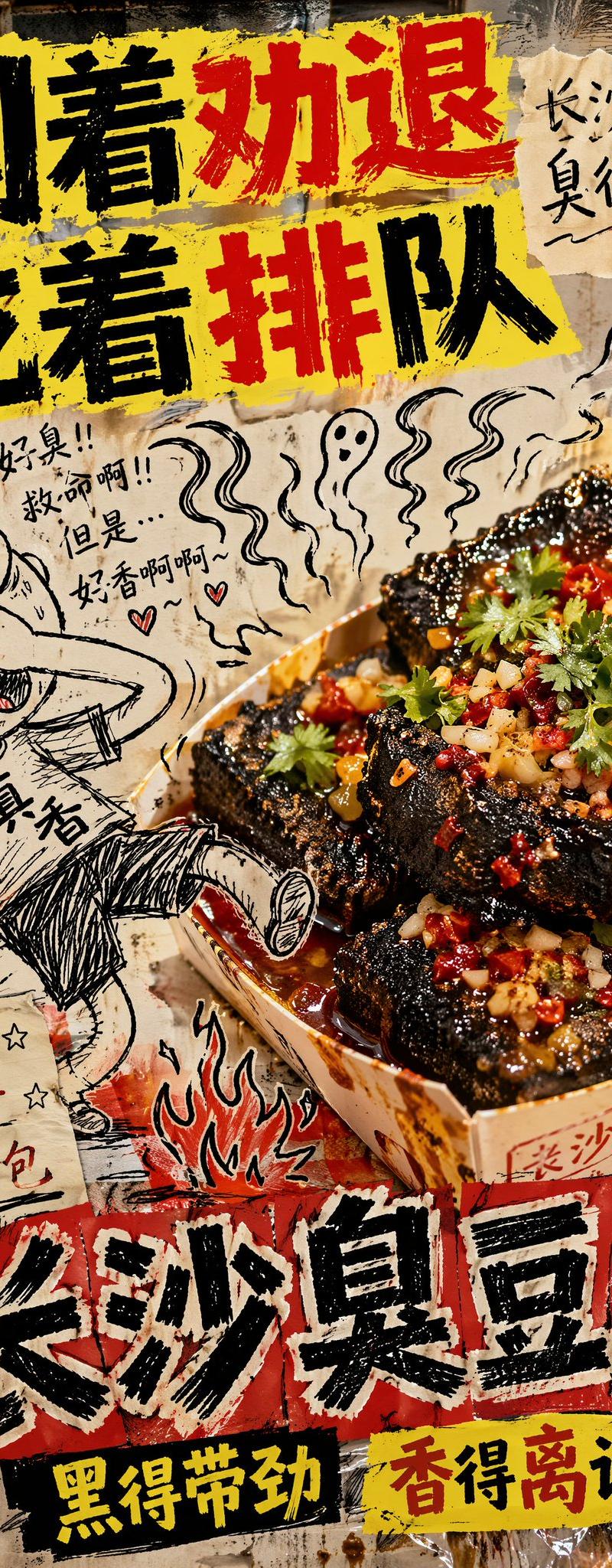
反设计风格长沙臭豆腐广告
一个充满创意与混乱感的“反设计”模因海报提示词,用于长沙臭豆腐,将超写实美食摄影与粗糙的手绘涂鸦相结合。
- 分类
- 海报营销
- 模型
- GPT Image 2
- 来源作者
- Loriel.AI
- 原始语言
- en
- 来源 ID
- 27420
- 发布时间
- 2026年7月2日
完整提示词
长沙臭豆腐创意合成街头美食广告,16:9 横向比例,刻意追求丑陋的“反设计”模因海报风格,混乱的低成本美食广告美学,构图故意杂乱且笨拙。背景看起来像是用油腻的夜市纹理、廉价的红黄色菜单碎片、沾满污渍的塑料桌布、不匹配的瓷砖墙碎片、手写项目、油渍以及丑陋的拼贴纸元素拼凑而成。强烈的非均匀闪光灯照明,局部轻微失焦,笨拙的阴影,糟糕的透视,以及刻意呈现出一种“5 分钟速成”的粗糙感。

画面中右侧中心是正宗长沙臭豆腐的实拍照片,作为主角产品。臭豆腐盛放在廉价纸碗或一次性餐盒中,呈现出深黑色的酥脆方块,质地粗糙多孔,边缘金黄酥脆,淋有鲜红的辣椒油、碎香菜、蒜末、酸豆角,浓郁的酱汁渗入缝隙中。添加可见的热气、油亮的反光、酥脆的表面细节、辛辣的香气感以及浓郁的深夜街头美食真实感。尽管周围的设计刻意杂乱丑陋,但食物本身应看起来超写实、美味、热气腾腾且令人垂涎。

与真实的臭豆腐笨拙互动的是一个粗糙的手绘黑色墨水卡通涂鸦角色,像是在笔记本上无聊时的随手涂鸦,四肢比例失调,线条歪歪扭扭,排线糟糕,表情滑稽。涂鸦角色一只手捏着鼻子,同时被夸张的香气波浪拖向长沙臭豆腐,眼睛变成了爱心状,口水直流,一只脚离地,仿佛被香气神奇地吸引过去。比例错误,透视错误,涂鸦的融合感故意做得非常糟糕。

在食物周围添加额外的丑陋涂鸦元素:
歪斜的香气波浪、
杂乱的箭头、
潦草的火焰、
笨拙的小星星、
汗滴、
颤抖的兴奋符号、
画得很难看的辣椒、
微小的幽灵状香气云、
潦草的手写侧注、
全部采用粗糙的黑色笔记本涂鸦风格。

在顶部,添加一句刻意丑陋但极其引人注目的中文标语,采用字距排版糟糕的反设计字体:

“闻着像劝退”
“吃着排长队”

在附近添加一条较小的凌乱手写侧注:

“这一口长沙”
“臭得刚刚好”

在底部中心,添加一个粗体扭曲的中文主标题:

“长沙臭豆腐”

以俗气的反设计风格添加一个虚构的街头小吃子品牌短语:

“黑得有实力”
“香得不可思议”

可选的额外丑陋手写中文文案:
“第一口:皱眉”
“第二口:真香”
“第三口:想打包带走”
多语言2
反设计风格长沙臭豆腐广告
zh-CN长沙臭豆腐创意合成街头美食广告,16:9 横向比例,刻意追求丑陋的“反设计”模因海报风格,混乱的低成本美食广告美学,构图故意杂乱且笨拙。背景看起来像是用油腻的夜市纹理、廉价的红黄色菜单碎片、沾满污渍的塑料桌布、不匹配的瓷砖墙碎片、手写项目、油渍以及丑陋的拼贴纸元素拼凑而成。强烈的非均匀闪光灯照明,局部轻微失焦,笨拙的阴影,糟糕的透视,以及刻意呈现出一种“5 分钟速成”的粗糙感。 画面中右侧中心是正宗长沙臭豆腐的实拍照片,作为主角产品。臭豆腐盛放在廉价纸碗或一次性餐盒中,呈现出深黑色的酥脆方块,质地粗糙多孔,边缘金黄酥脆,淋有鲜红的辣椒油、碎香菜、蒜末、酸豆角,浓郁的酱汁渗入缝隙中。添加可见的热气、油亮的反光、酥脆的表面细节、辛辣的香气感以及浓郁的深夜街头美食真实感。尽管周围的设计刻意杂乱丑陋,但食物本身应看起来超写实、美味、热气腾腾且令人垂涎。 与真实的臭豆腐笨拙互动的是一个粗糙的手绘黑色墨水卡通涂鸦角色,像是在笔记本上无聊时的随手涂鸦,四肢比例失调,线条歪歪扭扭,排线糟糕,表情滑稽。涂鸦角色一只手捏着鼻子,同时被夸张的香气波浪拖向长沙臭豆腐,眼睛变成了爱心状,口水直流,一只脚离地,仿佛被香气神奇地吸引过去。比例错误,透视错误,涂鸦的融合感故意做得非常糟糕。 在食物周围添加额外的丑陋涂鸦元素: 歪斜的香气波浪、 杂乱的箭头、 潦草的火焰、 笨拙的小星星、 汗滴、 颤抖的兴奋符号、 画得很难看的辣椒、 微小的幽灵状香气云、 潦草的手写侧注、 全部采用粗糙的黑色笔记本涂鸦风格。 在顶部,添加一句刻意丑陋但极其引人注目的中文标语,采用字距排版糟糕的反设计字体: “闻着像劝退” “吃着排长队” 在附近添加一条较小的凌乱手写侧注: “这一口长沙” “臭得刚刚好” 在底部中心,添加一个粗体扭曲的中文主标题: “长沙臭豆腐” 以俗气的反设计风格添加一个虚构的街头小吃子品牌短语: “黑得有实力” “香得不可思议” 可选的额外丑陋手写中文文案: “第一口:皱眉” “第二口:真香” “第三口:想打包带走”
反设计风格长沙臭豆腐广告
enCreative composite street-food advertisement for Changsha stinky tofu, 16:9 horizontal aspect ratio, intentionally ugly anti-design meme poster, chaotic low-budget food ad aesthetic, deliberately cluttered and awkward composition. The background looks badly assembled from greasy night-market textures, cheap red-yellow menu scraps, stained plastic table covers, mismatched tiled wall fragments, handwritten price boards, oil splatters, and ugly pasted paper elements. Harsh uneven flash lighting, slightly off focus in places, awkward shadows, bad perspective, and an intentionally unpolished “made in 5 minutes” look. At the center-right is a real-life photograph of authentic Changsha stinky tofu as the hero product. The tofu is served in a cheap paper bowl or disposable snack tray, featuring deep black crispy cubes with rough porous texture, golden crunchy edges, vivid red chili oil, chopped coriander, minced garlic, pickled long beans, and glossy sauce dripping into the cracks. Add visible steam, oily reflections, crunchy surface detail, spicy aroma feeling, and strong late-night street food realism. The food itself should look hyper-realistic, delicious, hot, and craveable, even though the surrounding design is intentionally messy and ugly. Awkwardly interacting with the real stinky tofu is a badly hand-drawn black ink cartoon doodle character, scribbly and crude like a bored notebook sketch, with disproportionate limbs, wobbly line art, bad crosshatching, and silly emotional expression. The doodle character is pinching its nose with one hand while being dragged toward the Changsha stinky tofu by exaggerated smell waves, eyes turning into hearts, drooling uncontrollably, one foot lifted off the ground as if the smell is magically pulling it in. The scale is wrong, the perspective is wrong, and the doodle is integrated terribly on purpose. Add extra ugly doodle elements around the food: crooked smell waves, messy arrows, scribbled flames, awkward little stars, sweat drops, shaky excitement marks, badly drawn chili peppers, tiny ghost-like aroma clouds, sloppy handwritten side notes, all in rough black notebook-doodle style. At the top, add a deliberately ugly but highly eye-catching Chinese slogan in badly kerned anti-design typography: “闻着劝退” “吃着排队” Add a smaller messy handwritten side note nearby: “长沙这口” “臭得很对” At the lower center, add a bold distorted main title in Chinese: “长沙臭豆腐” Add a fake street-snack sub-brand phrase in tacky anti-design style: “黑得带劲” “香得离谱” Optional additional ugly handwritten Chinese copy: “第一口皱眉” “第二口真香” “第三口想打包”