四款模型动漫海报对比
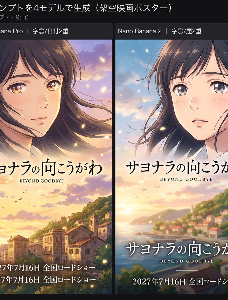
一张宽幅基准测试图,对比了四张虚构动漫电影海报,重点展示日语标题和上映日期的排版准确性。
- 分类
- 海报营销
- 模型
- GPT Image 2
- 来源作者
- AI Video Project
- 原始语言
- en
- 来源 ID
- 28058
- 发布时间
- 2026年7月8日
完整提示词
目标:制作一张宽幅社交媒体对比图,将四张由 AI 生成的虚构动漫电影海报并排展示,以评估其日语标题和上映日期的渲染准确性。

画布:1200 × 625 px 横向图像,采用深炭灰色背景。顶部预留约 45 px 高的标题栏,下方分为四个等宽的垂直海报面板,面板间由窄深色间隙隔开。

标题文本:在左上角设置大型日语标题 {argument name="headline text" default="画像モデル対決:同じキービジュアル・プロンプトを4モデルで生成(架空映画ポスター)"}。在其下方使用较小的灰色日语文本添加 {argument name="subtitle text" default="評価軸=日本語タイトル/公開日の描画精度。全モデル同一プロンプト・9:16"}。

布局:使用 4 个海报列,每列顶部设有一个细长的深色标签栏。从左到右,四个标签依次为:1) “gpt-image-2|文字の完璧”, 2) “Nano Banana Pro|字◎/日付2重”, 3) “Nano Banana 2|字○/題2重”, 4) “Seedream 5.0|誤字&改行”。每张海报均为 9:16 的垂直动漫电影主视觉图。

海报主题与风格:四张海报均描绘同一部虚构的日本动漫爱情/剧情片,场景设定在海边的日落时分。采用明亮、富有情感的动漫电影海报风格,柔和的绘画光影,温暖的橙粉色晚霞,闪烁的萤火虫般光点,沿海山丘,远处的滨海小镇,海平线,天空中的飞鸟,以及一位留着被风吹乱的深棕色长发、拥有明亮大眼睛的忧郁少女。保持每张海报视觉上的相似性,但在裁剪和构图上略有不同,以体现不同图像模型的输出差异。

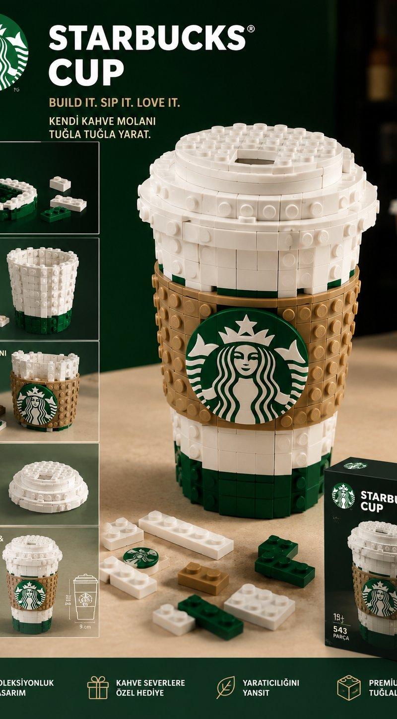
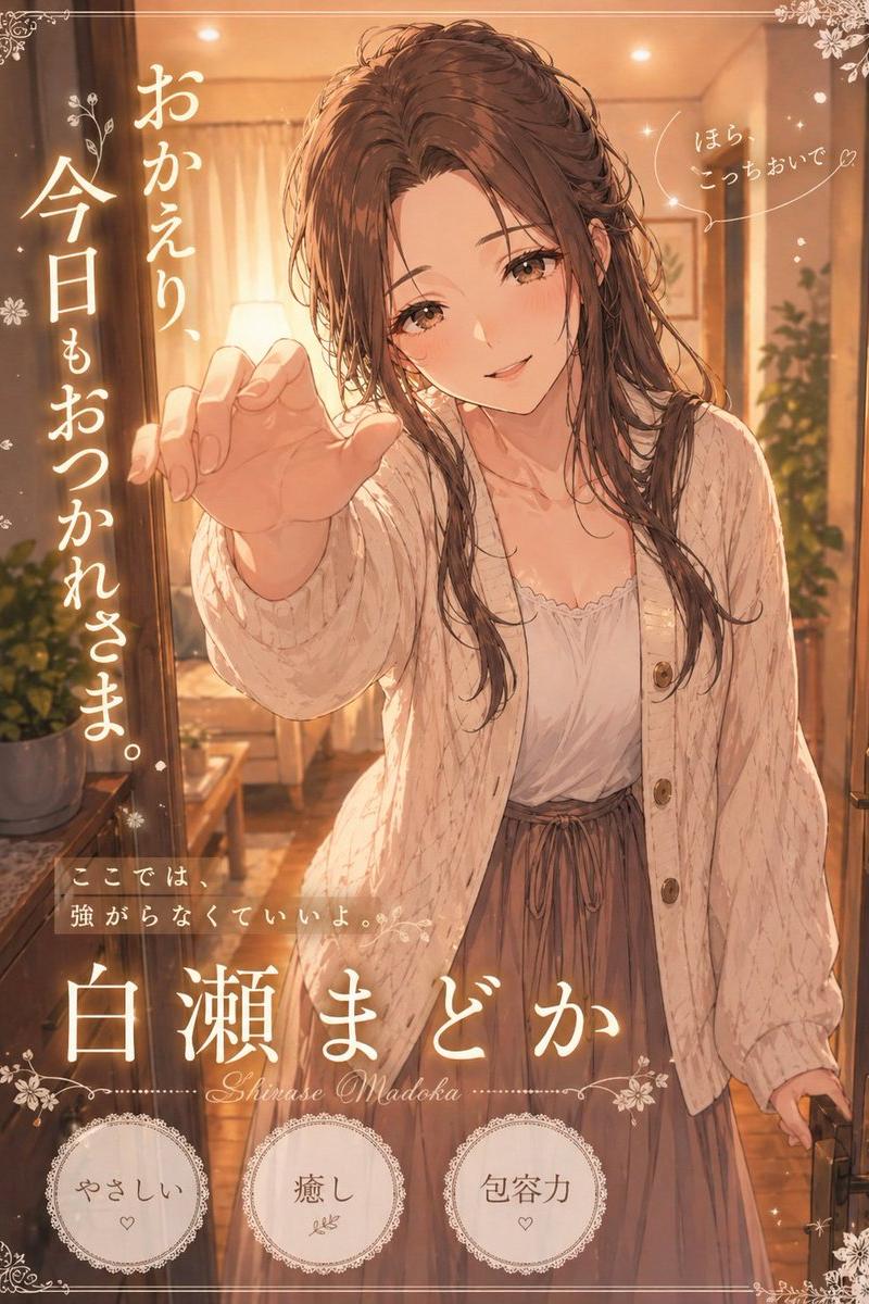
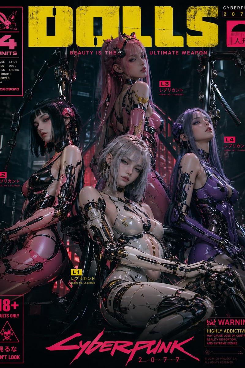
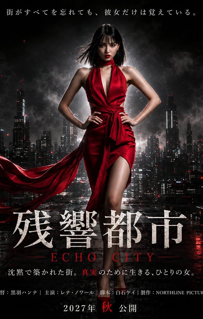
面板细节:面板 1 展示少女左上角特写,转头看向观众,下方为大海与小镇;排版严谨,标题位于中间,下方配有英文副标题,底部为上映日期。面板 2 展示少女在山坡小镇与大海背景下的近景肖像;刻意将底部的上映日期行重复两次,标题保持一次。面板 3 展示少女居中,背景为模糊的滨海小镇;刻意将日语标题重复两次,分别位于中部和海报下方,底部保留一行上映日期。面板 4 展示少女右侧面部特写,下方为大海与小镇;日语标题呈现出尴尬的断行和错误感,上映日期行居中于下方偏中位置。

海报文本内容:虚构电影标题为 {argument name="movie title" default="サヨナラの向こうがわ"}。英文副标题为 {argument name="english subtitle" default="BEYOND GOODBYE"}。上映日期文本为 {argument name="release date text" default="2027年7月16日 全国ロードショー"}。标题使用优雅的日语明朝体,英文副标题使用小号间距衬线大写字母。确保第一个面板排版最整洁、最准确。

限制条件:保持 4 个面板和指定的标签栏。不要添加任何 Logo、水印、额外面板、其他模型名称或无关文本。最终图像应看起来像是一张推文附带的基准测试图,用于对比四种图像模型的排版规范性。多语言2
四款模型动漫海报对比
zh-CN目标:制作一张宽幅社交媒体对比图,将四张由 AI 生成的虚构动漫电影海报并排展示,以评估其日语标题和上映日期的渲染准确性。 画布:1200 × 625 px 横向图像,采用深炭灰色背景。顶部预留约 45 px 高的标题栏,下方分为四个等宽的垂直海报面板,面板间由窄深色间隙隔开。 标题文本:在左上角设置大型日语标题 {argument name="headline text" default="画像モデル対決:同じキービジュアル・プロンプトを4モデルで生成(架空映画ポスター)"}。在其下方使用较小的灰色日语文本添加 {argument name="subtitle text" default="評価軸=日本語タイトル/公開日の描画精度。全モデル同一プロンプト・9:16"}。 布局:使用 4 个海报列,每列顶部设有一个细长的深色标签栏。从左到右,四个标签依次为:1) “gpt-image-2|文字の完璧”, 2) “Nano Banana Pro|字◎/日付2重”, 3) “Nano Banana 2|字○/題2重”, 4) “Seedream 5.0|誤字&改行”。每张海报均为 9:16 的垂直动漫电影主视觉图。 海报主题与风格:四张海报均描绘同一部虚构的日本动漫爱情/剧情片,场景设定在海边的日落时分。采用明亮、富有情感的动漫电影海报风格,柔和的绘画光影,温暖的橙粉色晚霞,闪烁的萤火虫般光点,沿海山丘,远处的滨海小镇,海平线,天空中的飞鸟,以及一位留着被风吹乱的深棕色长发、拥有明亮大眼睛的忧郁少女。保持每张海报视觉上的相似性,但在裁剪和构图上略有不同,以体现不同图像模型的输出差异。 面板细节:面板 1 展示少女左上角特写,转头看向观众,下方为大海与小镇;排版严谨,标题位于中间,下方配有英文副标题,底部为上映日期。面板 2 展示少女在山坡小镇与大海背景下的近景肖像;刻意将底部的上映日期行重复两次,标题保持一次。面板 3 展示少女居中,背景为模糊的滨海小镇;刻意将日语标题重复两次,分别位于中部和海报下方,底部保留一行上映日期。面板 4 展示少女右侧面部特写,下方为大海与小镇;日语标题呈现出尴尬的断行和错误感,上映日期行居中于下方偏中位置。 海报文本内容:虚构电影标题为 {argument name="movie title" default="サヨナラの向こうがわ"}。英文副标题为 {argument name="english subtitle" default="BEYOND GOODBYE"}。上映日期文本为 {argument name="release date text" default="2027年7月16日 全国ロードショー"}。标题使用优雅的日语明朝体,英文副标题使用小号间距衬线大写字母。确保第一个面板排版最整洁、最准确。 限制条件:保持 4 个面板和指定的标签栏。不要添加任何 Logo、水印、额外面板、其他模型名称或无关文本。最终图像应看起来像是一张推文附带的基准测试图,用于对比四种图像模型的排版规范性。
四款模型动漫海报对比
enGoal: Create a wide social-media comparison graphic showing four AI-generated fictional anime movie posters side by side, evaluating Japanese title and release-date rendering accuracy. Canvas: 1200 × 625 px horizontal image with a dark charcoal background. Add a top header area about 45 px tall, then four equal vertical poster panels beneath it separated by narrow dark gutters. Header text: At the top left, set the large Japanese headline {argument name="headline text" default="画像モデル対決:同じキービジュアル・プロンプトを4モデルで生成(架空映画ポスター)"}. Below it in smaller gray Japanese text, add {argument name="subtitle text" default="評価軸=日本語タイトル/公開日の描画精度。全モデル同一プロンプト・9:16"}. Layout: Use exactly 4 poster columns, each with a thin dark label bar at the top. The four labels, from left to right, must read: 1) “gpt-image-2|文字の完璧”, 2) “Nano Banana Pro|字◎/日付2重”, 3) “Nano Banana 2|字○/題2重”, 4) “Seedream 5.0|誤字&改行”. Each poster is a vertical 9:16 anime film key visual. Poster subject and style: All four posters depict the same fictional Japanese anime romance/drama film set at sunset by the sea. Use a luminous, emotional anime movie-poster style, soft painterly lighting, warm orange and pink sunset clouds, sparkling firefly-like light particles, coastal hills, a distant seaside town, ocean horizon, birds in the sky, and a melancholic young woman with windblown dark brown hair and large reflective eyes. Keep each poster visually similar but slightly different in crop and composition to suggest outputs from different image models. Panel details: Panel 1 shows the girl in upper-left close-up turning toward the viewer, with the sea and town below; it has disciplined typography with the title once near the middle, English subtitle below, and release date once at the bottom. Panel 2 shows a closer portrait of the girl over a hillside town and sea; intentionally duplicate the release-date line at the bottom twice while keeping the title once. Panel 3 shows the girl centered above a blurry seaside town; intentionally duplicate the Japanese title twice, one near the middle and one lower on the poster, while keeping one release-date line at the bottom. Panel 4 shows a close-up face on the right with ocean and town below; make the Japanese title appear awkwardly broken across lines and slightly wrong-looking, with the release date line centered near the lower middle. Poster text content: The fictional film title is {argument name="movie title" default="サヨナラの向こうがわ"}. The English subtitle is {argument name="english subtitle" default="BEYOND GOODBYE"}. The release text is {argument name="release date text" default="2027年7月16日 全国ロードショー"}. Use elegant Japanese Mincho-style title lettering and small spaced serif caps for the English subtitle. Make the first panel the cleanest and most typographically correct. Constraints: Maintain exactly four panels and exactly the specified label bars. Do not add logos, watermarks, extra panels, extra model names, or unrelated text. The final image should look like a tweet-attached benchmark image comparing layout discipline across four image models.